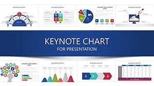
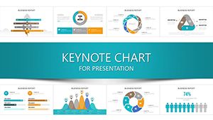
Navigate complex initiatives effortlessly using our Various Projects Keynote charts templates, built for managers, teams, and analysts juggling multiple tasks. These versatile visuals cover everything from progress trackers to resource allocators, ensuring your data tells a clear story.
Geared toward project leads in tech, construction, or events, they provide drag-and-drop charts like swimlanes and dependency maps. Scale them to fit any scope, color-code for priorities, and animate for phased reveals that keep everyone aligned.
Check out the range and chart your path to smoother executions. Precision meets flexibility in every slide.
Client Interaction Keynote Charts: Forge Connections That Convert
ID: #KC00595
$20.00
(1200)
Social Network Marketing Keynote Charts Template
ID: #KC00551
$18.00
(1054)
Department of Commerce Keynote Charts: Professional Visuals for Impact
ID: #KC00512
$14.00
(874)
Dynamic Model Animation Charts in Keynote
ID: #KC00460
$18.00
(326)
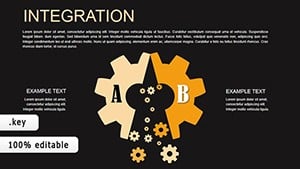
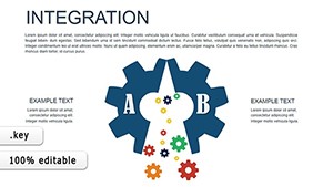
Animated Integration Charts for Architects
ID: #KC00438
$18.00
(1131)
Architectural Business Model Keynote Charts
ID: #KC00436
$16.00
(488)
Integration Keynote Charts: Weave Data Threads into Cohesive Narratives
ID: #KC00433
$16.00
(140)
Money Demand Keynote Charts: Chart the Economic Pulse
ID: #KC00423
$12.00
(282)
Sustainable Development Keynote Charts: Transform Data into Impactful Stories
ID: #KC00394
$13.00
(643)
3D Analytics Graphs Keynote Template: Sculpt Your Data into 3D Masterpieces
ID: #KC00353
$19.00
(276)
Social Networks Tables Keynote: Weaving Connections into Compelling Visuals
ID: #KC00347
$14.00
(867)
Training Infographic Keynote Charts - Instant Download | ImagineLayout
ID: #KC00342
$15.00
(995)
Transform Your Keynote Presentations with Dynamic Infographic Charts
ID: #KC00336
$20.00
(184)
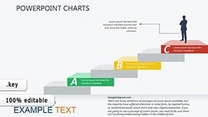
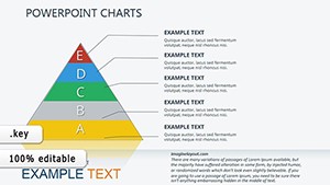
Business Optimization Keynote Charts: Pyramid Power for Process Pros
ID: #KC00334
$20.00
(268)
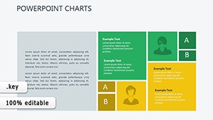
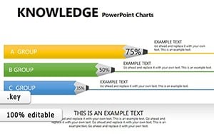
Knowledge Education Keynote Charts: Ignite Minds with Visual Brilliance
ID: #KC00252
$22.00
Empowering Projects with Dynamic Keynote Charts
Various Projects charts transcend rigid spreadsheets by offering fluid, Keynote-native visuals that adapt to evolving scopes. Unlike static defaults, they include smart connectors that auto-update, saving hours on revisions.
A PM coordinating a product launch could cascade a critical path diagram, nodes lighting up as deadlines approach.
Broad Use Cases for Project Mastery
Software Development: Map sprints with burndown curves that arc toward completion milestones.
Event Coordination: Venn overlaps for vendor synergies, shading shared responsibilities.
Research Teams: Funnel diagrams narrowing hypotheses to validated outcomes.
They outpace generics with formula-embedded cells for auto-calcs and exportable data layers. Tip: Group related charts into master slides for consistent theming.
Adapting Charts to Your Workflow
Reshape bars into radars for multi-metric views or chain Sankeys for flow audits. Trigger builds on hover for interactive deep dives. This agility turns dashboards into living tools.
In a cross-dept rollout, stack donut segments for budget slices, each clickable to sub-ledgers for granular audits.
Optimizing Chart Usage in Keynote Projects
Initiate with an executive summary radar, spokes radiating key metrics. Sequence into drill-downs, expanding nodes like unfolding plans. Finale with a heatmap of risks, warming to alerts.
Curate data ruthlessly; visuals thrive on relevance. Leads cite 30% faster buy-ins thanks to intuitive flows.
Proven Examples Across Scenarios
Construction Phases: Gantt rails paralleling site photos, bars bridging to inspections.
Marketing Campaigns: Tree maps branching tactics, leaves sized by ROI projections.