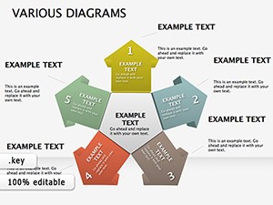
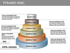
Simplify your data storytelling with triangle diagram Keynote templates. These geometric designs leverage the power of triangles to represent hierarchies, processes, and relationships, making abstract concepts tangible and easy to grasp.
Aimed at educators, consultants, and project managers, the templates provide layered triangles for breakdowns - from broad overviews at the base to key details at the apex. Vibrant colors and smooth animations enhance engagement without overwhelming the viewer.
Built for Keynote, they support effortless tweaks: resize segments, recolor fills, or add labels in seconds. Whether mapping organizational structures or funnel analyses, these diagrams elevate your presentations from good to unforgettable.
Dive into our triangle diagram collection and shape your message with precision.
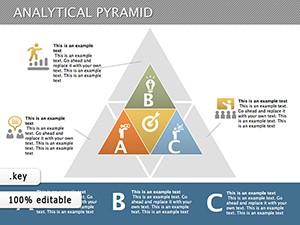
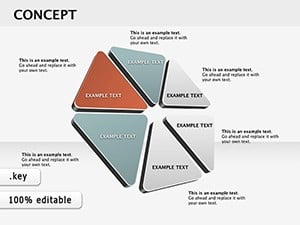
Triangle diagrams offer a compact, intuitive way to visualize layers of information, outperforming cluttered charts in clarity. Our Keynote templates harness this shape`s stability to depict everything from priority pyramids to decision trees, infused with clean lines and balanced proportions.
Picture a sales funnel: Base triangle for leads, narrowing to conversions at the top - paired with metrics, it instantly reveals bottlenecks. This focused design aids retention, as geometric simplicity aids cognitive processing.
From boardrooms to classrooms, these templates adapt seamlessly:
Standard Keynote shapes lack pre-styled options, requiring manual alignment; our templates come ready-to-use, saving design effort while ensuring polish. They foster deeper discussions by clarifying interconnections.
Use complementary colors - blues for stability, greens for growth - to evoke emotions aligned with your topic. Limit text to 5-7 words per segment, and incorporate subtle shadows for depth.
Creative hack: Rotate triangles for Venn-like overlaps, illustrating synergies in team roles. This adds dynamism to static data.
Teams using these diagrams report 40% faster audience understanding. Explore now to integrate clarity into your workflow.
Apply in marketing for customer journey maps or in HR for skill pyramids. For workshops, use interactive versions where participants drag segments to collaborate.
Employ transparency on inner triangles to reveal underlying data progressively. Pair with timelines for phased project visuals, creating a roadmap effect.
Accessibility note: Ensure high contrast and describe diagrams verbally for inclusivity.
These tools transform presentations into strategic assets. Download your set and diagram your way to success.
Copyright © 2009-2026 ImagineLayout All rights reserved.