Navigate complex data with ease using our traffic Keynote charts templates, engineered for transportation experts, city officials, and logistics managers. These specialized designs turn raw numbers into compelling stories, highlighting peak hours, route efficiencies, and bottleneck resolutions through intuitive visualizations.
From heat maps of urban gridlock to line graphs tracking seasonal fluctuations, each template is pre-built with Keynote`s charting tools in mind, ensuring smooth integration and animation. Tailored for boardroom briefings or public consultations, they make dense information digestible and actionable.
Customization is a breeze: swap datasets via simple imports, tweak colors to match city branding, and add annotations for context. Elevate your analyses from spreadsheets to strategic assets.
Delve into our traffic Keynote charts collection and chart a course to clearer decision-making. With variants for every metric - volume, speed, emissions - your presentations will drive home the message.


Default charts in Keynote can overwhelm with uniform styles, but our traffic-specific templates use layered symbology - like vehicle icons for volume or color gradients for density - to convey nuances at a glance. This approach not only saves presentation time but also boosts comprehension, turning stakeholders into advocates for infrastructure improvements.
Key advantages include scalability for large datasets and compatibility with real-time feeds, making them indispensable for ongoing monitoring.
Urban planners deploy these for zoning proposals, where Sankey diagrams illustrate traffic redistribution post-development. Logistics firms analyze supply chain delays with Gantt-style timelines overlaid on route maps.
Versus standard tools, these templates reduce manual data plotting by 50%, allowing focus on interpretation over illustration.
Start with clean data imports from CSV or Excel, then apply filters to highlight trends. Use Keynote`s build effects for sequential reveals, building suspense in your narrative. For clarity, limit to 5-7 data series per chart and include legends that double as key takeaways.
Accessibility tip: Ensure sufficient contrast in color schemes and provide textual summaries for each visual. Test on projectors to verify legibility from afar.
Envision a city council meeting where a radial chart pulses to show hourly cycles, or a freight optimizer`s dashboard exported as animated GIFs for email updates. These real applications demonstrate how templates adapt to predictive modeling or historical reviews alike.
Integrate with GIS layers for geo-spatial depth, exporting to interactive PDFs for post-presentation exploration.
Steer your data forward. View traffic Keynote charts templates and select the perfect fit for your next analysis.
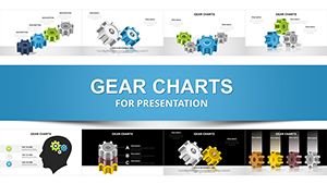
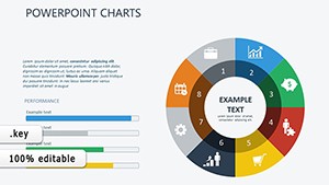
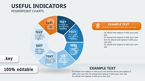
From pie and bar to advanced radar and treemaps, all geared toward traffic metrics like volume and velocity.
Yes, via Keynote`s data linking features, supporting updates from external sources without rebuilding.
Absolutely - adjust timing, directions, and triggers to align with your speaking points.
They offer superior design flexibility and presentation polish, with easier export to multi-slide contexts.
Templates include Unicode fonts and right-to-left layouts for global traffic studies.
Accelerate your insights. Download traffic Keynote charts today!
Copyright © 2009-2026 ImagineLayout All rights reserved.