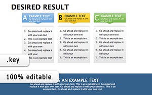
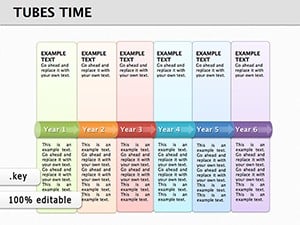
Unlock the flow of ideas with our time-oriented diagram templates for Keynote, where temporal structures clarify processes and relationships. These tools are essential for analysts, designers, and speakers aiming to demystify timelines and sequences.
Featuring arrow flows, cycle diagrams, and phased layouts, they cater to technical and creative minds alike. Native Keynote compatibility means smooth integration and edits.
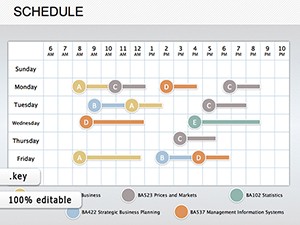
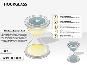
From subtle hourglass icons to expansive Gantt charts, find the diagram that resonates. Craft diagrams that not only inform but inspire action.
Diagram your direction - download immediately.
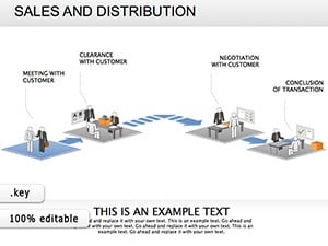
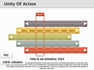
These diagrams excel in sequencing, far beyond static shapes, with temporal connectors that guide understanding intuitively.
Superior sequencing over basics.
Adjust node timings for emphasis; blend with photos for context. "Process Pulse" pulses phases alive.
Event planners sequence logistics; musicians chart compositions. Endless possibilities.
Visualize time - grab yours.
Smart objects allow non-destructive tweaks, preserving integrity.
Elevates diagram efficacy.
IT diagrams deployments; marketers flow campaigns. Adaptable excellence.
Flow freely - download.
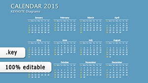
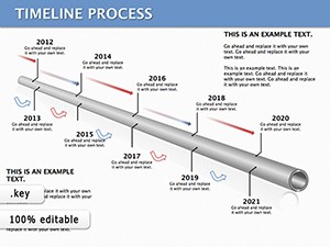
Flows, cycles, timelines.
Completely.
Yes, vector-based.
Shareable links.
Guided layers.
Copyright © 2009-2026 ImagineLayout All rights reserved.