Bring chronological data to life in your Apple Keynote presentations using our specialized time-themed chart templates. Tailored for users who demand precision in visualizing schedules, growth trajectories, and event sequences, these charts blend intuitive drag-and-drop editing with sophisticated styling to make your points unforgettable.
Targeted at executives, analysts, and creative directors, they simplify the art of storytelling through time. From quarterly performance overviews to event planning breakdowns, each template ensures your audience grasps the big picture at a glance. With responsive elements that shine on Retina displays, your charts remain crisp and compelling.
Browse our gallery to uncover charts that resonate with your narrative. Effortlessly tweak scales, add annotations, and infuse personality - transforming raw numbers into persuasive visuals. Get started now and watch your presentations gain momentum.
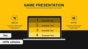
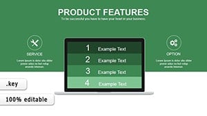
Keynote`s elegance pairs perfectly with our time-oriented chart templates, offering a step up from basic bar graphs or pie charts. These designs incorporate timeline integrations, allowing seamless fusion of temporal data with quantitative metrics for holistic views.
For instance, a sales team might deploy a hybrid line-timeline chart to correlate revenue spikes with marketing timelines, revealing cause-and-effect patterns vividly. In education, stacked area charts mapped against academic calendars help teachers track student progress over semesters.
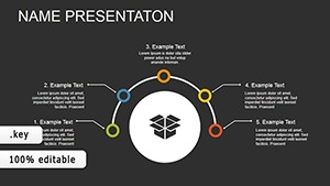
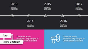
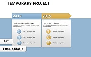
Pro tip: Align chart orientations with your slide flow - horizontal for broad overviews, vertical for deep dives. Incorporate thematic icons like clocks or arrows to reinforce the time motif without overwhelming the design.
Financial advisors leverage waterfall charts with timeline overlays to depict budget allocations over fiscal years, making adjustments crystal clear. Event coordinators use Gantt-inspired charts to synchronize vendor timelines, preventing overlaps and ensuring smooth executions.
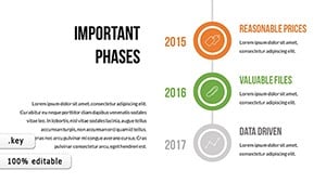
Creative professionals, such as filmmakers, apply curved progress charts to storyboard production phases, blending dates with task visuals for pitch decks that captivate investors. Non-profits track fundraising cycles with radial timelines, showcasing donor impact chronologically to inspire continued support.
Users appreciate how these templates cut preparation time by half, freeing creativity for content refinement. Unlike scattered online resources, our cohesive set maintains Keynote`s native polish.
Curious to chart your success? Peruse our options and select the chart that timelines your triumph. Your story deserves to unfold with precision.
They use standard shapes and data links, allowing full compatibility with Keynote`s build-in tools for effortless enhancements.
Yes, with optimized structures that handle extensive time series without performance lags.
Certainly - export as PDF or images while preserving vector quality for reports.
Adjust axes via simple sliders; templates support daily, monthly, or yearly increments.
They embed sequential elements, turning static data into dynamic progress narratives.
Copyright © 2009-2026 ImagineLayout All rights reserved.