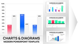
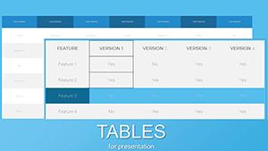
Enhance your slides with hybrid table PowerPoint charts that combine structured tables and dynamic charts for clear data storytelling.
Ideal for financial summaries, project trackers, and HR dashboards, these templates transform dense information into visually digestible slides, making insights accessible at a glance.
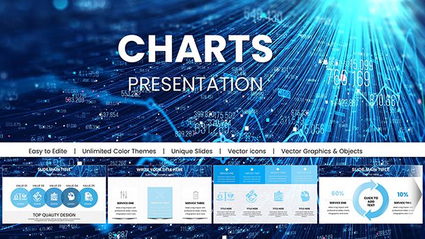
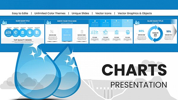
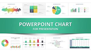
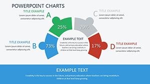
Innovative Perspective Meaning PowerPoint Charts Template
ID: #PC00451
$18.00
(737)
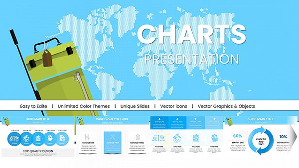
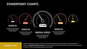
User Experience PowerPoint Charts for Professional Presentations
ID: #PC00404
$12.00
(280)
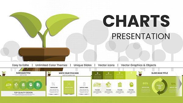
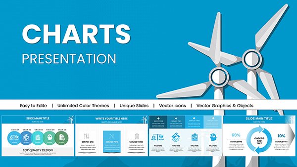
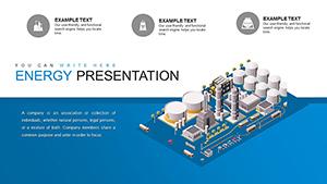
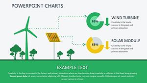
Renewable Energy PowerPoint Charts: Sustainable Presentation Templates
ID: #PC00398
$16.00
Why Choose Hybrid Table PowerPoint Charts
Our table chart templates merge tabular data with visual charts to deliver actionable insights efficiently. They reduce clutter and enhance readability compared to standard PowerPoint tables.
Real-World Use Cases
Finance: Visualize budgets and expense reports with embedded charts.
Project Management: Track timelines and KPIs with integrated tables and charts.