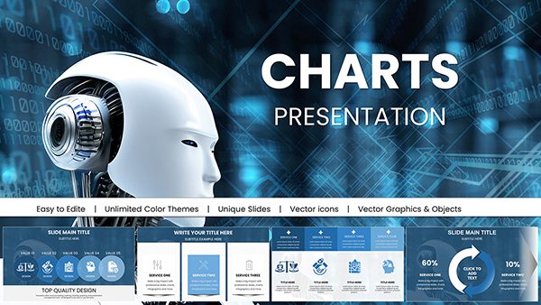
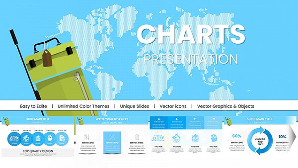
Sometimes numbers alone don`t tell the full story. Adding meaningful symbols and icons turns dry data into memorable visual narratives that audiences connect with instantly. Our collection of over 100 symbol chart templates for PowerPoint and Keynote does exactly that.
Visually rich yet clear, these templates combine professional charts with carefully chosen icons to represent categories, processes, or concepts at a glance. Fully editable, with modern flat designs and optional animations.
Free downloads available alongside premium versions packed with extra icon sets and layouts. Perfect for infographics, reports, and creative pitches.
Dive into the collection and discover templates that bring your data to life.
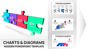
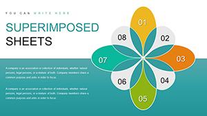
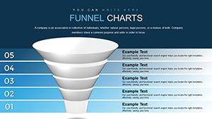
Funnel PowerPoint Charts Template for Presentation
ID: #PC00639
$22.00
(557)
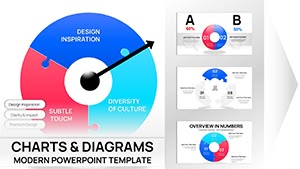
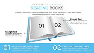
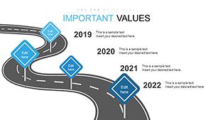
Roadmap and Signs PowerPoint Charts Template: Navigate Your Projects with Clarity
ID: #PC00630
$15.00
(711)
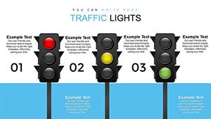
Free Traffic Lights PowerPoint Charts for Professional Presentations
ID: #PC00619
free
(518)
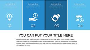
Training Courses PowerPoint Charts Template: Inspire Learning with Visuals
ID: #PC00594
$15.00
Why Symbol Charts Engage Audiences Better
Icons and symbols tap into visual processing, helping viewers understand and remember information faster than text or numbers alone. Our templates balance aesthetic appeal with clarity, ensuring your message remains front and center.
Each design uses high-quality, scalable vector icons that look sharp on any screen size.
Real-World Applications
Marketing and Pitch Decks
Illustrate customer journeys, feature comparisons, or market segments with intuitive icons that make complex ideas instantly understandable.
Process and Workflow Presentations
Map steps with symbol-connected flow charts that guide viewers through procedures clearly and attractively.
Annual Reports and Infographics
Turn statistics into compelling stories by pairing data with relevant icons that add context and emotional resonance.
Advantages Over Plain Charts
Standard charts can feel cold and corporate. Our symbol templates offer:
Extensive icon libraries for every industry
Harmonious color coordination
Editable icon sizes and positions
Layered designs for easy customization
Modern minimalist or bold styles
The result is higher engagement and better information retention.
Creative Tips for Symbol Charts
Get the most from these templates:
Choose icons that directly represent your data categories
Maintain consistent icon style throughout
Limit icons per chart to avoid clutter
Use size or color to indicate magnitude
Pair with short, punchy labels
Our templates make following these principles effortless.
Ready to make your data unforgettable? Explore our symbol chart collection and download your favorites now.