Sequence success with our strip PowerPoint charts, streamlined for narrating progressions in any endeavor. For project managers, historians, and coordinators, they orchestrate data into orderly tales that propel understanding.
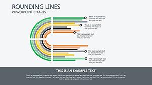
Ideal for Gantt evolutions, assembly lines, or event recaps, charts employ banded layouts with milestone ticks. Advance from disjointed lists to cohesive corridors guiding eyes along journeys.
Boons: Flexible durations, dependency links, and crisp connectors. Orchestrate flows that flow naturally.
Align your arcs - check strip charts and sequence yours swiftly.
Progress demands depiction. Strip PowerPoint charts map software sprints, banding tasks by velocity burns. Manufacturing overseers trace batches, striping quality checks against outputs.
Event planners timeline agendas, with buffer strips for contingencies. Legal chronologies strip case evolutions, timestamping filings.
Excel over timelines with multi-tier nesting.
Standard timelines tangle; strips segment cleanly, with zoomable granulates. UVPs: Overlap detectors, auto-gaps for realism.
Prioritize left-to-right logics. Innovate with color ramps signaling urgencies.
Accelerate planning by 40%.
Pro: Link to calendars for live pulls.
Integrate KPIs per strip for holistic views. In R&D, patent timelines strip innovations.
Superior nesting depths. Example: Agency`s campaign strip won client praise.
Balance densities. Validate sequences. Version for variants.
Strip to essentials - adopt a chart and advance assuredly.
Copyright © 2009-2026 ImagineLayout All rights reserved.