Strategies PowerPoint Charts

Transform your data into compelling visual stories with our extensive collection of PowerPoint chart templates. Whether you're presenting quarterly results, analyzing market trends, or explaining complex datasets, these ready-to-use designs help you communicate with clarity and impact. Each template is fully customizable, compatible with both PowerPoint and Google Slides, and designed to save you hours of formatting time.

Our collection includes bar charts, line graphs, pie charts, area charts, scatter plots, and advanced data visualization designs - all crafted for business professionals, educators, marketers, and analysts who need presentation-ready solutions. Explore all templates in this category and discover the perfect design for your next presentation.


View by: Last Added | Most Popular
  • like 5
    (870)
    Strategic Access PowerPoint Charts for Business Pros
    ID: #PC00751
    $24.00
  • like 4
    (90)
    Marketing Strategies PowerPoint Charts Template
    ID: #PC00356
    $14.00
  • like 4
    (599)
    Strategic Analysis Charts: PowerPoint Template
    ID: #PC00345
    $19.00
  • like 4
    (771)
    7-Part Pie Graphs PowerPoint Template: Detailed Data Mastery
    ID: #PC00120
    $24.00


Why PowerPoint Chart Templates Matter for Modern Presentations

In today's data-driven business environment, the ability to present information clearly separates successful presentations from forgettable ones. PowerPoint chart templates provide the foundation for transforming raw numbers into narratives that resonate with your audience. Unlike standard charts that often look generic and uninspiring, professionally designed templates incorporate color theory, visual hierarchy, and proven design principles that guide viewer attention exactly where you need it.

Research consistently shows that audiences retain visual information 65% better than text alone. When you combine data with thoughtful visual design, you're not just showing numbers - you're telling a story that stakeholders, clients, and team members can understand and remember. Professional templates eliminate the guesswork, providing tested layouts that balance aesthetics with functionality.

Essential Chart Types for Business Communication

Different data scenarios demand different visualization approaches. Bar charts excel at comparing discrete categories, making them ideal for sales comparisons, survey results, or performance metrics across departments or products. Their vertical or horizontal orientation provides flexibility depending on label length and presentation space.

Line charts shine when tracking changes over time, perfect for revenue growth, website traffic trends, or project timelines. The continuous flow of data points creates an intuitive visualization of progress, making it easy to spot trends, seasonality, or anomalies at a glance.

Pie charts and donut charts effectively illustrate proportions and market share breakdowns. While sometimes criticized for complex datasets, they remain powerful for showing simple part-to-whole relationships like budget allocation, demographic distribution, or resource utilization. Modern templates enhance these classics with strategic color choices and clear labeling.

Area charts combine the best of line and bar charts, emphasizing magnitude of change over time. They're particularly effective for cumulative data, multiple data series comparisons, or highlighting the volume behind trends. Stacked area charts can show both individual and combined totals simultaneously.

Scatter plots reveal relationships between two variables, making them indispensable for correlation analysis, identifying outliers, or exploring complex data relationships. When paired with trend lines, they become predictive tools that support strategic planning and hypothesis testing.

Professional Templates vs. Standard PowerPoint Charts

While PowerPoint includes basic charting tools, professional templates offer distinct advantages that justify their use in important presentations. Standard charts often default to bland color schemes, inconsistent typography, and layouts that prioritize function over form. Professional templates address these limitations with carefully curated design elements.

Premium templates feature cohesive color palettes that align with modern presentation trends and maintain accessibility standards for colorblind viewers. Typography is optimized for readability at various screen sizes and projection distances. Layout spacing ensures data labels never overlap and legends are positioned for maximum clarity without crowding the visual field.

Beyond aesthetics, quality templates include smart placeholders that maintain design integrity as you input your data. This means consistent spacing, automatic scaling, and proportional adjustments that preserve visual balance. You spend less time fighting with formatting and more time refining your message.

Best Practices for Chart Design and Data Storytelling

Even the most sophisticated template requires thoughtful implementation. Start by identifying your core message - what single insight should viewers take away? Design your chart to emphasize that message through strategic use of color, annotation, and focus. Use contrasting colors to highlight key data points while keeping supporting information in muted tones.

Simplify relentlessly. Remove gridlines unless essential for precision. Eliminate unnecessary labels, borders, and decorative elements that don't serve the data story. The most effective charts often have the simplest design, allowing data to speak clearly without visual competition.

Context is critical. Include units, timeframes, and baseline information that help viewers interpret values correctly. A line showing revenue growth means little without clarifying whether figures represent thousands or millions, monthly or annual data. Annotations can highlight significant events, thresholds, or comparative benchmarks that add meaning to patterns.

Consider your audience's familiarity with data visualization. Executive audiences often prefer high-level summaries with bold trends, while technical teams may appreciate detailed breakdowns and multiple data series. Adjust complexity accordingly, and always test charts at actual presentation size to ensure readability.

Customization Strategies for Brand Consistency

Professional templates accelerate design work while maintaining flexibility for brand alignment. Most templates support easy color scheme modifications - simply select branded colors for primary data series, then use tints and shades for variations. This creates visual cohesion across all presentation materials.

Typography customization ensures charts match your corporate style guide. Replace template fonts with your organization's approved typefaces, adjusting sizes as needed for optimal legibility. Consistent font usage across slides creates professional polish and reinforces brand identity.

Incorporate company logos, icons, or graphical elements that complement rather than overwhelm the data visualization. Subtle branding in corners or margins maintains corporate identity without competing for attention with your data story. The goal is enhancement, not distraction.

Use Cases Across Industries and Functions

Sales and marketing teams leverage chart templates for pipeline analysis, campaign performance reporting, customer segmentation displays, and competitive positioning maps. Templates help communicate ROI, conversion rates, and market trends to stakeholders who make funding decisions.

Financial analysts depend on sophisticated charts for budget variance analysis, forecasting models, cash flow projections, and investment portfolio performance. Clean, professional visualizations build credibility in board presentations and investor communications.

Human resources departments use charts for workforce analytics, recruitment pipeline tracking, employee satisfaction surveys, training completion rates, and diversity metrics. Visual presentations help leadership understand people-related trends and make data-informed decisions about talent strategy.

Educators and trainers find templates invaluable for presenting research findings, illustrating statistical concepts, comparing case studies, and making abstract data concrete for learners. Well-designed charts enhance comprehension and retention in both classroom and virtual learning environments.

Project managers utilize Gantt charts, milestone trackers, resource allocation visualizations, and burn-down charts to keep teams aligned and stakeholders informed about project health, timelines, and deliverables.

Technical Considerations and Compatibility

Modern chart templates prioritize cross-platform compatibility. Most designs work seamlessly in both PowerPoint and Google Slides, though minor formatting adjustments may be needed when switching between platforms. Test templates in your target presentation software before important meetings to confirm all elements render correctly.

Resolution matters for projected presentations and printed materials. High-quality templates use vector graphics that scale without pixelation, ensuring crisp visuals whether displayed on laptop screens or large conference room projectors. This scalability also supports export to PDF or image formats without quality loss.

Data integration workflows vary by template sophistication. Some templates connect to Excel data sources for automatic updates, while others require manual data entry. For recurring presentations like monthly reports, investing time in data-linked templates pays dividends through reduced preparation time.

Accessibility features like sufficient color contrast, alternative text for screen readers, and clear labeling ensure presentations reach all audience members effectively. Templates meeting WCAG standards demonstrate organizational commitment to inclusive communication.

Ready to elevate your presentations? Browse our complete collection of chart templates and discover designs that transform your data into persuasive visual stories. Each template is immediately downloadable and fully editable - start creating impactful presentations today.

Frequently Asked Questions

What types of chart templates are available for PowerPoint?

Our collection includes bar charts, line charts, pie charts, donut charts, area charts, scatter plots, combination charts, waterfall charts, funnel diagrams, Gantt charts, organizational charts, and advanced data dashboard layouts. Each category offers multiple design variations to match different presentation styles and industry needs.

Can I customize colors and fonts in these chart templates?

Yes, all templates are fully editable. You can modify colors to match your brand palette, change fonts to align with corporate style guides, adjust sizes and proportions, and add or remove data series. Templates maintain design integrity even after customization, ensuring professional results regardless of modifications.

Are these templates compatible with Google Slides?

Most templates work with both PowerPoint and Google Slides.
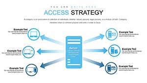
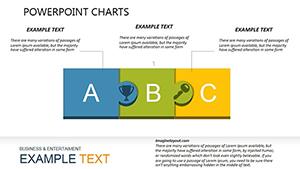
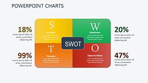
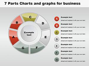
 While some advanced features may require minor adjustments when switching platforms, core functionality and design elements transfer reliably. We recommend testing templates in your preferred software before important presentations.

How do professional templates differ from PowerPoint's built-in charts?

Professional templates offer superior visual design, cohesive color palettes, optimized typography, strategic layout spacing, and preset formatting that saves significant time. They incorporate design principles that enhance data comprehension and viewer engagement, while built-in charts often require extensive manual formatting to achieve professional appearance.

What's the best chart type for comparing sales data across regions?

Bar charts excel at regional comparisons, allowing easy visual comparison of values across categories. For showing both regional performance and trends over time, consider combination charts that merge bars and lines. If you're comparing proportions or market share, pie charts or stacked bar charts effectively communicate relative sizes.

Can I use these templates for client presentations and reports?

Absolutely. These templates are designed specifically for professional business communications including client presentations, board meetings, investor pitches, quarterly reports, and strategic planning sessions. Their professional aesthetic and clear data visualization help build credibility and facilitate decision-making conversations.