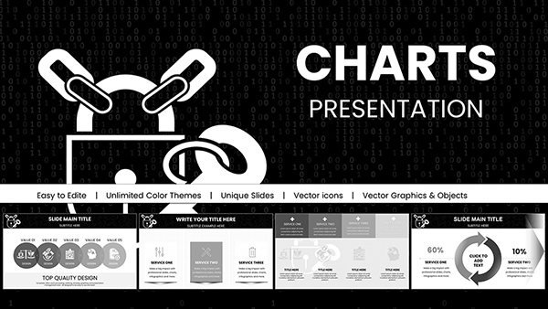
Navigate the complexities of business analytics with our strategic PowerPoint chart templates, ideal for data enthusiasts, managers, and analysts seeking to demystify numbers. These charts distill vast datasets into actionable visuals that inform and impress.
Whether forecasting budgets or benchmarking performance, our designs prioritize accuracy and allure, with features like auto-scaling axes and thematic icons that contextualize data beautifully.
Effortlessly import from spreadsheets, tweak for your narrative, and present with poise - transforming routine updates into strategic showcases.
Chart Your Course: Browse our business-centric collection and gain clarity.
Business intelligence thrives on visuals that reveal patterns amid noise. Our templates outpace defaults with embedded formulas for variance calculations and trend lines that auto-extend forecasts.
They embrace accessibility, with screen-reader tags and color-blind palettes, broadening reach.
Supply chain overviews use Sankey flows to trace material paths, optimizing logistics. Customer segmentation employs treemaps, sizing cohorts by value for targeted marketing.
ESG reporting features gauge charts for sustainability scores, circling progress toward goals.
Waterfall breakdowns dissect P&L, stacking revenues against expenses vividly.
Radar profiles competitor strengths, polygonal comparisons for gap analysis.
Choose types wisely: Histograms for distributions, avoiding 3D distortions. Label axes clearly, sourcing data footnotes for credibility.
Employ sparklines in tables for micro-trends, and filter views for audience tailoring. Validate with peer reviews pre-presentation.
Analytics Tip: Use secondary axes for disparate scales.
Basics lack conditional visuals; ours highlight outliers with dynamic bubbles. Pre-sets for industries like retail heatmaps speed setup.
Deliver precision with panache.
A logistics firm charted route efficiencies with network diagrams, rerouting to cut fuel 20%. E-commerce analyzed cart abandonment via funnel cascades, tweaking UX for uplift.
HR tracked turnover with survival curves, predicting retention risks. These charts drove decisions that mattered.
Insight Awaits: Download and analyze smarter.
Copyright © 2009-2026 ImagineLayout All rights reserved.