Dive into data excellence with square PowerPoint chart templates, engineered for Microsoft`s versatile environment. These templates utilize square confines to encapsulate insights neatly, suiting data enthusiasts in finance, research, and operations.
Square charts distill complexity into digestible units, boosting comprehension in high-volume presentations. Key advantages: seamless data linking, auto-updating visuals, and theme harmony. Visualize ROI trends in a unified square - transformative and time-saving.
Tailored for consideration-stage users refining their analytical edge. Scan our offerings and pinpoint the chart that powers your narrative.
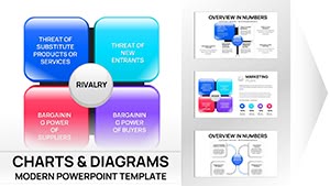
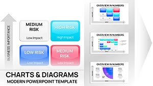


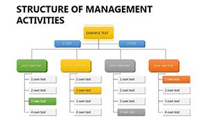
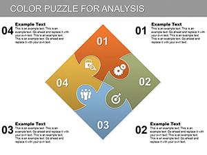
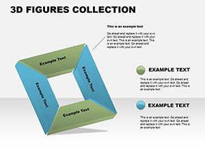
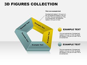
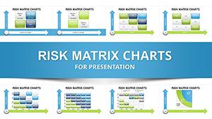
In PowerPoint, square charts harmonize with the ribbon interface, facilitating quick insertions. They thrive in scenarios demanding equity, like balanced scorecards or quadrant analyses.
Outshining radial charts, squares ground abstract metrics in tangible forms, enhancing trust in findings. Pre-linked Excel sheets in templates expedite updates.
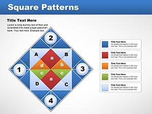
Harness chart legends positioned at square corners for intuitive decoding.
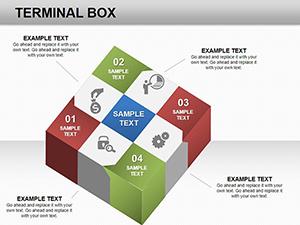
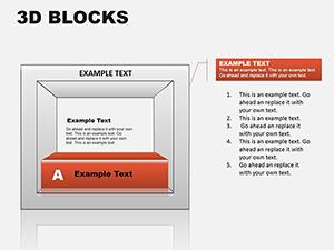
Assemble squares to narrate progress: Baseline square evolves via morphs into outcome views. For investor updates, four-square matrices dissect opportunities.
Templates boast conditional formatting, mirroring Excel for live data syncs. Accessibility features include screen-reader friendly labels.
Yield insights that persuade and inform.
A fintech startup leveraged square charts for pitch decks, securing funding through crystal-clear projections. Researchers at a lab adopted them for conference posters, simplifying peer reviews.
Creative hack: Animate square expansions to spotlight anomalies, riveting audiences. PowerPoint`s ink annotations complement static charts dynamically.
Mitigate distortion by locking aspect ratios; for voluminous data, segment into linked slides. Prioritize sans-serif fonts for legibility.
Native integration trumps add-ins, ensuring reliability.
Template integration via add-ins for batch processing. Share via Teams for collaborative tweaks.
Pro level: Embed Power Query for advanced square data pulls.
Amplify your impact - secure a square chart template and data-dazzle.
Copyright © 2009-2026 ImagineLayout All rights reserved.