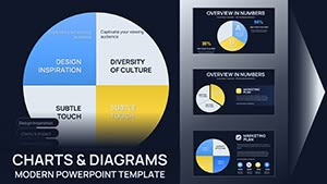
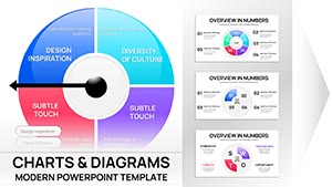
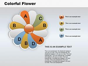
Infuse your data presentations with the rhythm of Spotify using our specialized chart templates for PowerPoint. These designs mimic the streaming giant`s sleek interface, featuring waveform graphs, playlist grids, and album art placeholders that turn numbers into narratives.
Targeted at music industry pros, data analysts tracking listener habits, or educators breaking down streaming stats, these templates simplify complex datasets into intuitive visuals. Vinyl-inspired bars and equalizer lines make trends pop, while dark mode options ensure versatility for any screen.
Editable to the core, swap datasets effortlessly and sync with Excel for real-time updates. Whether pitching label deals or classroom reports, these charts keep audiences tuned in. Peruse the library and compose your symphony of slides today.
Unlike basic bar graphs, these templates pulse with energy - equalizer animations rise with values, and color gradients echo popular track hues, boosting comprehension by making data feel alive and relatable.
In music marketing, A&R teams visualize artist growth via waveform timelines; analysts chart genre shifts with radial playlists. Educationally, they demystify algorithms for media studies classes.
They outshine stock charts by integrating multimedia - embed audio snippets for context. Best practice: Limit to 5-7 colors per slide, drawing from Spotify`s palette for brand cohesion.
Case study: A festival organizer layered attendance data over a mock playlist, increasing sponsor buy-in through immersive mockups. Tip: Use transparency on waves for overlapping datasets without chaos.
Ready to remix your reports? Explore Spotify chart templates and download to amplify your impact.
Advanced: Link charts to live Spotify APIs via PowerPoint add-ins for auto-refreshing playlists. Value add: Responsive scaling for hybrid events, maintaining clarity from laptop to projector.
Studies show such visuals retain 65% more info; harness that edge.
With PowerPoint`s data connectors, yes - import via CSV exports from Spotify for Artists.
Edit the theme colors in PowerPoint`s design tab; the templates adapt automatically.
Fully - adjust timing and easing in the animation pane for your pace.
Export as PPTX and import; minor tweaks may be needed for transitions.
Opt for simplified versions with fewer elements to avoid zoom issues.
Tune into success with these beats. Get your template and chart the course ahead.
Copyright © 2009-2026 ImagineLayout All rights reserved.