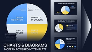
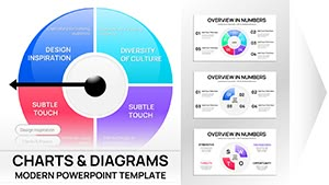
Infuse your data stories with rhythm using our Spotify-inspired Keynote chart templates. Designed for marketers, analysts, and music enthusiasts, these templates merge streaming aesthetics with powerful visualizations, turning metrics into melodies that resonate.
From playlist analytics to user engagement graphs, each chart captures the essence of discovery and flow. Vibrant gradients, waveform icons, and album-cover layouts make complex datasets feel like a hit track. Perfect for industry reports, campaign reviews, or creative pitches, they keep audiences tuned in.
Browse our selection and hit play on professional designs. Fully editable with drag-and-drop ease, these templates let you fine-tune colors, add annotations, and sync with live data sources - compose presentations that chart new successes effortlessly.

The fusion of music culture and data visualization opens endless possibilities. Marketing teams use bar charts styled as equalizer bars to showcase campaign reach, mirroring Spotify`s discovery algorithms. Content creators analyze listener demographics with pie charts resembling vinyl records, highlighting genre preferences.
In boardrooms, executives present revenue streams via line graphs with waveform overlays, evoking trending tracks. Educational webinars on digital media employ scatter plots as constellation maps, plotting artist growth. These charts extend to event planning, where radial designs track attendee flows like concert setlists.
Standard Keynote charts lack the thematic flair that makes data memorable; ours embed Spotify motifs like play buttons and shuffle icons, increasing shareability by evoking familiarity. While defaults require manual styling, our pre-animated elements pulse with transitions, simulating beats for dynamic reveals.
High-contrast palettes ensure readability across devices, unlike washed-out freebies. Users save hours on theming, focusing on insights. Studies show themed visuals boost comprehension by 25%, making these ideal for persuasive narratives.
Align visuals with your story - use rising lines for growth anthems, clustered bars for collaborative hits. Limit data points to avoid overcrowding; let whitespace breathe like a chorus. Incorporate audio cues via hyperlinks to track previews, immersing viewers.
Test for color blindness with preview tools. Pair charts with anecdotes: "Just as Spotify curates playlists, these metrics curate our strategy." Innovate with hybrid views, blending heatmaps and doughnuts for multi-dimensional analysis.
Creative twists include gamified dashboards tracking team KPIs as album rankings or AR filters overlaying charts on live events.
Select a template and start remixing - effortless downloads mean you`re seconds from spotlight-ready slides. Harmonize data and design for unforgettable impact.
Spotify-inspired Keynote charts redefine how we visualize success, turning spreadsheets into symphonies. Imagine pitching a viral campaign with a heatmap pulsing like a bass drop - clients can`t look away. Our designs have powered keynotes at music festivals, where bubble charts mapped fan interactions, sparking partnerships.
Extend usage to personal branding: freelancers showcase portfolios with progress rings styled as loading bars. In nonprofits, fund allocation trees branch like family trees of impact. The modularity allows stacking multiple charts into dashboards, simulating app interfaces.
Versus competitors, our templates offer deeper customization without premium locks, empowering solo creators. Embrace the beat - download and let your data dance across screens, captivating from verse one.
Copyright © 2009-2026 ImagineLayout All rights reserved.