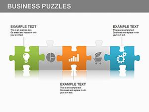
Spider diagrams, with their web-like structures, excel at centralizing core ideas while branching to related elements, making them ideal for mind mapping in PowerPoint. Our templates feature radial layouts that expand intuitively, accommodating hierarchies without clutter.
Geared toward project managers, researchers, and creatives, they visualize relationships, from mind maps to performance radars. Editable nodes and curved lines ensure fluid adjustments, turning abstract thoughts into tangible visuals.
PowerPoint`s robust tools amplify them with glow effects and rotation animations, drawing eyes to key connections. Great for reports, pitches, or educational aids.
Web your thoughts: Explore spider diagrams and connect the dots.
These diagrams radiate from a nucleus, ideal for thematic exploration - our PowerPoint versions include pre-curved connectors that auto-adjust. They outperform linear lists by revealing patterns spatially, aiding memory and discussion.
Marketers map campaign elements; scientists plot experiment variables. In classrooms, they structure essay outlines, promoting nonlinear thinking.
Generic shapes require manual alignment; ours snap into place with style presets.
Position the core theme boldly, then layer branches by importance - use thickness for emphasis. Animate outward growth to unveil progressively, building intrigue. Balance symmetry for aesthetics, varying lengths for natural flow.
Embed sub-nodes for depth, hyperlinking to details. Collaborate via OneDrive for shared refinements.
Such techniques make diagrams both beautiful and brainy.
A consulting firm spidered client pain points from service hubs, uncovering upsell paths. In publishing, authors diagram plot threads, visualizing arcs. Fitness coaches rate routines against goals, motivating clients visually.
Engineers model component interactions, diagnosing failures swiftly. Our variants range from simple stars to elaborate webs - adapt to your scope.
Smart objects and theme locks ensure consistency; animations preset for pro effects. Crisp vectors suit any scale, with 45% faster assembly per users. Licensing frees commercial creativity.
Updates align with PowerPoint evolutions, keeping you ahead.
Branch out boldly: Choose spider diagrams and weave winning narratives.Copyright © 2009-2026 ImagineLayout All rights reserved.