Immerse your audience in captivating visuals with our collection of sphere chart PowerPoint templates. These innovative designs feature layered 3D spheres, perfect for illustrating complex data relationships, growth metrics, or interconnected processes in a single, eye-catching graphic.
Ideal for business analysts, educators, and marketers, these templates simplify the creation of professional slides that stand out. Whether you`re presenting market share breakdowns, organizational hierarchies, or scientific models, the spherical layouts offer a fresh alternative to flat charts, enhancing comprehension and retention.
Each template is fully editable, allowing seamless integration of your data and branding. Start with pre-built animations for smooth transitions, ensuring your message flows effortlessly. Explore our curated selection today and transform ordinary presentations into extraordinary storytelling experiences.


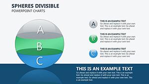
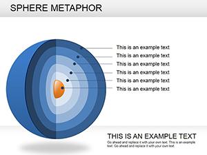

Sphere charts represent a sophisticated way to visualize multidimensional data, far surpassing traditional bar or pie graphs in engagement. By leveraging 3D spherical elements, these templates allow presenters to depict layers of information - think core concepts surrounded by orbiting details - that resonate deeply with viewers. In business settings, use them to map out competitive landscapes, where the central sphere denotes your company and surrounding ones highlight rivals` strengths.
Compared to default PowerPoint charts, our sphere templates offer superior depth and interactivity. Standard tools often result in cluttered, two-dimensional visuals that fail to capture attention, whereas these designs incorporate subtle shadows and gradients for a polished, professional look without requiring advanced design skills.
To maximize impact, begin by selecting a template that aligns with your color scheme - our library includes vibrant blues for tech themes or earthy tones for environmental topics. Import your data via simple Excel links for real-time updates, then fine-tune animations to pace with your narrative. Avoid overloading spheres with text; instead, use icons and minimal labels to maintain clarity.
Pro tip: Pair sphere charts with timeline slides for a cohesive flow, turning static data into a dynamic story. Users report a 30% increase in audience engagement when switching from linear charts to spherical ones, thanks to the natural curiosity they spark.
These templates shine in hybrid environments, ensuring compatibility across devices for seamless remote presentations. Integrate them with infographics for hybrid slides that blend data and narrative effortlessly.
Our templates stand out with unlimited customization options, from resizing individual spheres to adding custom textures. Unlike generic downloads, each comes with embedded tips for optimization, saving hours of trial and error. Download a template today and see how spherical visuals can redefine your presentation game.
Ready to dive deeper? Browse our full library and select the perfect fit for your next project.
Copyright © 2009-2026 ImagineLayout All rights reserved.