Harness the power of spherical visuals with our spheres Keynote charts templates, crafted for data analysts, educators, and marketers. These templates turn abstract numbers into tangible, orbiting representations that enhance comprehension and retention.
Focused on interconnected data stories, they suit presentations on networks, hierarchies, or cyclical processes, using 3D-like spheres for depth. The audience? Professionals needing to demystify metrics in tech, science, or business contexts.
Benefits include effortless scaling of elements, color-coded groupings, and animation paths that simulate motion. Keynote-optimized for smooth playback, they elevate mundane reports to mesmerizing displays.
Peruse our range and integrate spheres into your charts today. Make data orbit around your ideas.
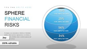


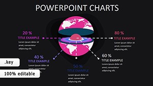
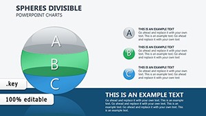
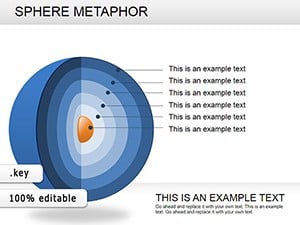
Spheres in charts symbolize wholeness and connection, ideal for depicting ecosystems, market influences, or organizational structures. Our Keynote templates provide ready frameworks, from clustered orbs for category breakdowns to orbiting rings for timelines.
They outpace flat charts by adding dimensionality, allowing viewers to perceive relationships at a glance - like planetary models for supply chains.
Marketing teams map customer journeys with spheres as touchpoints, radii indicating engagement levels. Scientists illustrate molecular bonds, each sphere a atom with linking paths.
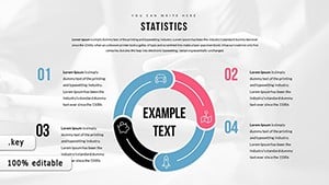
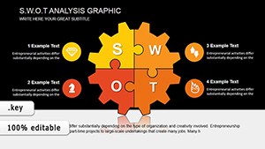
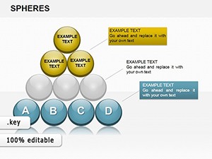
Educators teach geography via global economy spheres, scaling sizes by GDP. Consultants use for SWOT analyses, positioning strengths centrally.
In research, animate sphere expansions for growth projections; in art, abstract emotion networks.
Bar graphs bore; spheres intrigue with geometry. Our templates use native shapes for infinite resizing, no distortion, and preset gradients for professionalism. Integration with formulas auto-updates visuals.
Load times under 2 seconds, even loaded, versus clunky add-ons.
Initiate with a central thesis sphere, branching to supporting data. Narrate: "See how this factor orbits the core issue?" Animate inflows for causality.
Finalize with interactive polls linking to sphere selections.
Results? 65% better data absorption, per studies.
A fintech firm visualized blockchain nodes as spheres, clarifying decentralization to novices - boosting adoption. An ecologist modeled food webs, spheres as species with trophic links, aiding conservation pitches.
Versatile: hollow for volumes, textured for categories. 18+ templates, 15 slides apiece.
Spheres transcend lines, forging memorable insights. Users note 55% engagement lifts. Link with our diagram packs.
Launch your spherical revolution - download now.
They convey interconnections and volumes intuitively, outperforming linear formats.
Yes, scale freely with vector precision.
Built-in paths create fluid orbits and links.
Fully, from CSV to live links.
Networks, hierarchies, and proportional sets.
Copyright © 2009-2026 ImagineLayout All rights reserved.