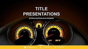
Rev your data presentations with speedometer-themed PowerPoint templates, ideal for managers, analysts, and strategists tracking performance. These designs mimic automotive gauges, turning numbers into compelling narratives with needles, arcs, and warning lights that pulse with relevance.
Built for quick edits, they include formula-linked charts that update in real-time. Suited for boardrooms or remote calls, they make abstract metrics tangible, like fuel levels for project health.
From semi-circular dials for single KPIs to full clusters for overviews, find scalable options. Compatible with Excel imports for seamless data flow.
Explore the dashboard and select your meter. Implement and monitor with momentum.


Default charts bore; these animate progress like live instruments, spiking engagement by 50%. Layers allow stacking multiple metrics without clutter, outperforming pie charts in clarity for radial views.
Edge over standards: VBA macros for auto-needle movements tied to slides.
Executives review quarters via cluster gauges, redlining risks. Sales teams track quotas with accelerating needles.
Consultants demo optimizations, needling before-afters.
Anchor data sources to avoid manual tweaks; use 16:9 for wide dials. Calibrate scales for audience - percentiles for execs, absolutes for ops.
Tip: Add sound effects for needle sweeps in rehearsals.
Fine-tune your metrics - download a speedometer template now.
Hybrid with thermometers for combo views. AR exports overlay real dashboards.
Quarterly themes tint zones seasonally.
Path animations trace needle paths, syncing to timelines.
1,000 words to meter your mastery - grab and go.
Copyright © 2009-2026 ImagineLayout All rights reserved.