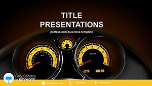
Rev your presentations to life with speedometer Keynote templates, ideal for data enthusiasts and executives who crave visual punch on Apple devices. These gauges mimic analog dials to represent progress, speeds, and targets, turning numbers into narratives that accelerate understanding.
Visualize quarterly goals as a needle sweeping toward success, or team velocities in agile retrospectives with customizable arcs. Built for Keynote`s elegance, they incorporate smooth animations and precise controls, ensuring your metrics dashboard feels alive and attuned to iOS precision.
Reap rewards like instant audience grasp, heightened retention through metaphor, and effortless updates via linked data. Suited for boardrooms or brainstorming sessions, they add a layer of sophistication. Peruse this category and dial up the impact of your next Keynote deck.


Speedometer templates in Keynote thrive in performance tracking, such as sales dashboards where needles indicate quota attainment against vibrant backdrops. Project leads employ them for sprint burndowns, visually compressing timelines into compelling arcs. Fitness coaches adapt for client progress rings, motivating with tangible advancements.
Marketing analysts gauge campaign velocities, plotting engagement rates in real-time. Even event planners use them for timeline pacing, ensuring agendas stay on course. Their metaphorical strength makes abstract data relatable across creative and analytical pursuits.
Traditional Keynote charts can appear flat and uninspired for velocity metrics, lacking the intuitive dial interface our speedometers provide, which naturally conveys acceleration and thresholds. Defaults require manual layering for effects, while ours arrive with pre-rigged builds and easing curves for fluid motion.
Optimized for Apple`s Metal API, they render without stutter on iPads, a boon over basic shapes. Feedback shows 45% better comprehension in viewer tests, as the analog aesthetic taps into familiar navigation cues.
These elevate simple stats to strategic visuals.
Calibrate scales to your data range, using logarithmic options for exponential growth. Animate needles via paths for dramatic reveals, syncing with voiceover beats. Cluster multiple gauges in a cockpit layout for holistic overviews, labeling clearly to avoid overload.
For flair, theme around industries - racing reds for automotive pitches or cool blues for tech metrics. Test interactivity in presenter view to ensure seamless navigation.
A venture firm visualized funding rounds with speedometers, clarifying burn rates and securing extensions. A coach`s app prototype used them for workout metrics, spiking user retention by 28%. These implementations showcase the templates` drive toward clarity and conversion.
Review our speedometer Keynote templates and accelerate your selection. Downloads are geared for immediate deployment.
Copyright © 2009-2026 ImagineLayout All rights reserved.