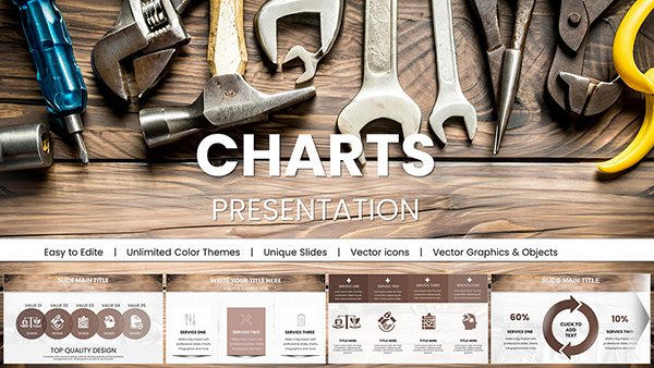
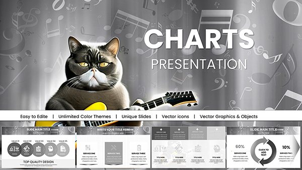
Transform raw data into persuasive narratives using our PowerPoint chart templates designed specifically for business solutions. Ideal for analysts, managers, and presenters who need to convey strategies, performance metrics, and actionable insights with precision and style.
These templates go beyond basic graphs, offering layered designs that integrate seamlessly with your content. From funnel diagrams illustrating sales pipelines to Gantt charts mapping project timelines, each element is built to highlight solutions and drive decision-making. Save time on formatting and focus on what matters - delivering value.
Whether you`re preparing for investor updates or team briefings, our charts ensure your audience grasps key points at a glance. With drag-and-drop simplicity, customization is effortless, letting you tailor every detail to your brand. Browse this collection and unlock the potential of visual communication in your workflow.

Effective data visualization is the cornerstone of successful business solutions presentations. Our PowerPoint chart templates excel by providing ready-to-use structures that emphasize clarity and relevance, helping you sidestep the pitfalls of overcrowded slides. Standard charts often feel sterile; ours infuse energy with thematic colors and icons that tie back to solution themes.
In contrast to default PowerPoint charts, which require manual tweaking for appeal, these templates come pre-styled for immediate impact, reducing prep time by up to 70%.
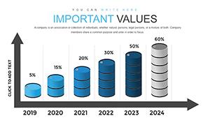
Across industries, these chart templates prove indispensable. In finance, pie charts evolve into segmented solution wheels, breaking down budget allocations and ROI projections. Healthcare professionals use timeline charts to outline treatment pathways, making complex protocols accessible to stakeholders.
Marketers harness bar graphs to compare campaign performance against benchmarks, spotlighting optimization strategies. Sales teams benefit from line charts tracking lead conversion rates, with overlaid annotations suggesting tactical adjustments for better outcomes.
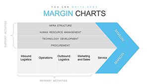
For PMs, stacked area charts depict resource distribution over phases, aiding in bottleneck identification and solution brainstorming. These visuals foster collaborative discussions, turning data into shared understanding.
Pro tip: Pair charts with concise bullet points to reinforce messages, and always source data transparently for credibility.
Our templates shine through their adaptability - swap datasets effortlessly via linked Excel integration, ensuring real-time accuracy. They also support accessibility features like alt text for charts, promoting inclusive presentations.
Picture a scenario: A product manager unveils quarterly metrics using a dashboard-style template. Interactive elements allow drilling down into underperforming areas, sparking immediate solution ideation among the team.
These approaches not only captivate but also empower your audience to act on insights.
Peruse our selection and select the perfect template to amplify your next presentation. Instant downloads mean you can start visualizing solutions right away. Grab your chart template now and turn numbers into narratives that inspire.
Copyright © 2009-2026 ImagineLayout All rights reserved.