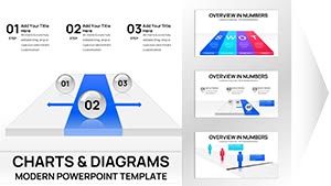
Bring data to life with our professional Keynote chart templates, where analytics meet artistry for presentations that persuade and inform. Aimed at data enthusiasts, executives, and researchers, these designs demystify metrics, revealing patterns at a glance.
Explore bar graphs, pie slices, and line trends with built-in formulas for instant calculations. Customize axes, legends, and styles to align with your theme, ensuring every chart supports your story. Great for quarterly reviews, academic theses, or sales forecasts.
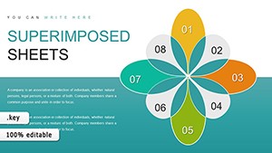
Why wrestle with raw figures when visuals can captivate? Our curated charts streamline your workflow. Peruse the options, select your fit, and download to start visualizing victory today.


Charts in Keynote are portals to insight, and our templates amplify this by offering responsive elements that adapt to datasets. Smart legends and tooltips provide context without clutter, ideal for dense information.
Financial analysts plot trends for investor decks, spotting growth curves vividly. Marketers segment audiences via radial charts, tailoring campaigns precisely. The precision fosters confidence, turning skeptics into advocates.
Stock charts demand manual formatting; ours automate aesthetics, cutting prep by hours.
Sales teams dashboard KPIs with heat maps, illuminating regional performances. Educators graph historical data for engaging lectures, with animated builds unveiling eras. Environmental reports use scatter plots to correlate variables, advocating change compellingly.
Each use leverages charts` strength in pattern recognition, enhancing discourse.
Adhering elevates credibility, as audiences trust visualized truths.
Default options lack flair, appearing utilitarian. Our templates infuse personality with thematic overlays, like fiscal calendars on bar charts. A CFO highlighted how such enhancements clarified budgets, expediting approvals.
Advanced filtering lets subsets shine, perfect for what-if scenarios.
Fuse charts with narratives: Pair sankey flows with explanatory text for resource tracking. Animate divergences in dual-axis plots for dramatic reveals. For interactivity, hyperlink segments to details, enriching explorations.
Updates bring AI-suggested layouts, evolving with data trends.
CSV, Excel, and direct entry; formulas link dynamically.
Thousands, with aggregation for large sets.
Yes, logarithmic or dual scales for nuanced views.
High-res PNG or vector SVG for publications.
Collaborate via shared links with change tracking.
Decode data dynamically. Download chart templates and let numbers narrate your success.
Copyright © 2009-2026 ImagineLayout All rights reserved.