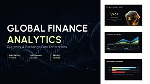
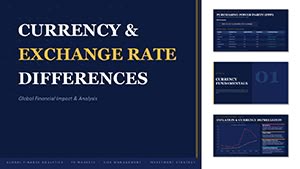
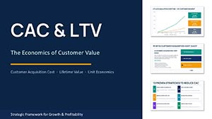
Research presentations demand absolute clarity and precision to communicate findings effectively. Our collection of over 100 research chart templates for PowerPoint and Keynote delivers exactly that - clean, professional visuals that let your data speak for itself.
Built for credibility, these templates feature precise scales, clear labeling, and minimalistic designs favored in academic and scientific settings. Fully editable and compatible with both platforms, they include classic chart types optimized for research data.
Many are available as free downloads, while premium versions add subtle animations for smoother delivery. Crafted with current design standards, they help you create publication-quality slides quickly.
Explore below and find the ideal template to showcase your research professionally.
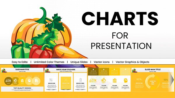
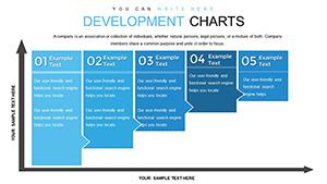
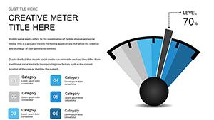
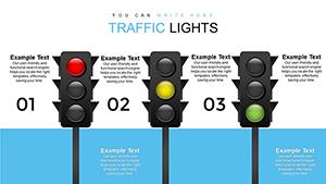
Free Traffic Lights PowerPoint Charts for Professional Presentations
ID: #PC00619
free
(493)
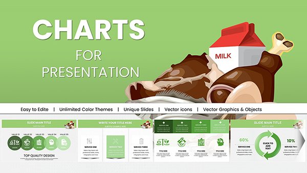
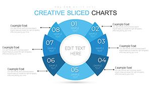
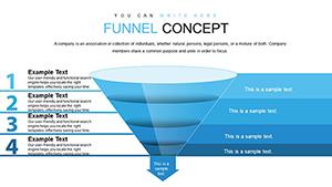
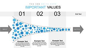
Free Innovation Funnel PPT Template: Streamline Your Idea Pipeline
ID: #PC00614
free
(154)
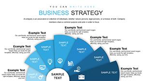
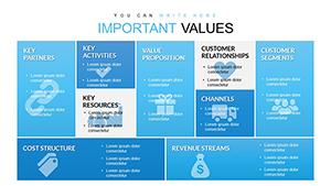
Free Business Model Canvas PowerPoint Template - Instant Download
ID: #PC00612
free
(127)
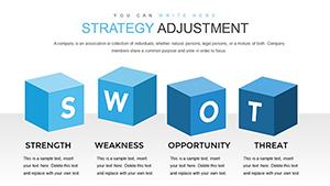
Logic of Operational Analysis PowerPoint Charts: Insightful Clarity
ID: #PC00603
$17.00
(1158)
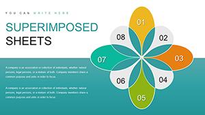
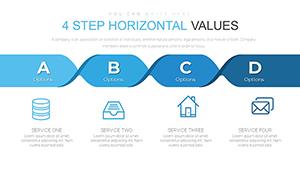
Place Value PowerPoint Charts Template - Editable Teaching Slides for Presentations
ID: #PC00601
$18.00
The Importance of Quality Research Charts
Great research deserves great visualization. Poor charts can obscure results or undermine credibility. Our templates prioritize accuracy, readability, and elegance, ensuring your audience focuses on the science rather than distracting design flaws.
Each design follows best practices for scientific communication, with thoughtful typography, neutral colors, and proper data-to-ink ratios.
Practical Use Cases
Academic Theses and Dissertations
Present experimental results, survey data, or literature comparisons with charts that meet university standards and impress defense committees.
Conference Presentations
Deliver findings in limited time with clear, high-impact visuals that help the audience grasp complex relationships instantly.
Market Research Reports
Business researchers use these templates to display consumer behavior, segmentation, and trend analysis with professional polish.
Benefits Compared to Standard Charts
Default templates often lack scientific rigor. Ours include:
Accurate axis scaling and gridlines
Proper error bars and confidence intervals
Clean, distraction-free layouts
Editable source citations and legends
Support for multiple data series
These details make your work look more authoritative and save significant formatting time.
Design Tips for Research Charts
Follow these guidelines for maximum clarity:
Choose the right chart type - line for trends, scatter for correlations, bar for comparisons
Avoid 3D effects that distort perception
Label axes clearly and include units
Use muted colors to differentiate data series
Include data sources directly on the slide
Our templates embed these principles, giving you a trusted starting point.
Ready to present your research at its best? Browse our complete collection of research chart templates and download today.
Frequently Asked Questions
What types of charts are best for research data?
Line charts for trends over time, scatter plots for correlations, bar charts for comparisons, and histograms for distributions are most common and effective.
Are these templates suitable for publication?
Yes - their clean, professional designs meet standards for journals, theses, and conference materials.
Can I add error bars or confidence intervals?
Absolutely - all elements are fully editable, making it simple to include statistical annotations.
Do you offer free research chart templates?
Yes, many high-quality templates are free to download, with premium options for additional features.
Will animations work in academic settings?
Premium templates include subtle, optional animations that enhance clarity without distracting from the science.