Transform raw data into compelling narratives using our specialized Keynote diagram templates for reports. Tailored for analysts, managers, and consultants, these designs simplify complex information through intuitive visuals like flowcharts, Venn diagrams, and radial maps.
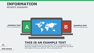
Ideal for quarterly reviews, project updates, or market analyses, each template ensures your insights land with precision. Picture a Sankey diagram tracing budget allocations or a bubble chart revealing trend correlations - tools that turn numbers into stories your audience can follow effortlessly.
Fully compatible with Keynote`s native features, our templates support seamless animations and transitions. Whether you`re in finance tracking KPIs or marketing mapping customer journeys, these resources save time while boosting professionalism. Start exploring this category to uncover diagrams that make your reports unforgettable.
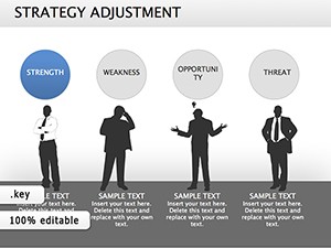
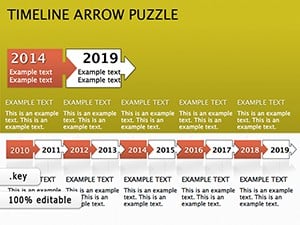
Standard report slides often drown in spreadsheets, but Keynote diagrams cut through the noise. Our collection outperforms defaults by offering layered hierarchies that reveal relationships at a glance, such as mind maps for strategic planning or Gantt charts for timelines.
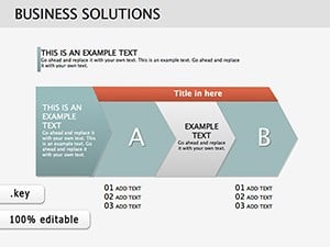
In corporate environments, they excel for board meetings where executives need quick overviews. A waterfall diagram can dissect revenue streams, highlighting variances more vividly than bullet points. For creative agencies, process flows illustrate campaign stages, fostering collaboration.
Healthcare pros use organigrams to outline department structures, clarifying roles amid expansions. In education, educators deploy pyramid diagrams for hierarchical topics like ecosystem layers, engaging students visually.
Versus basic shapes, our pre-formatted elements include data links, auto-updating as figures change. Pro tips: Anchor labels to avoid clutter and use opacity for emphasis on outliers.
Treasurers leverage balance sheet radars to compare fiscal years, spotting imbalances instantly. This method not only informs but also anticipates trends.
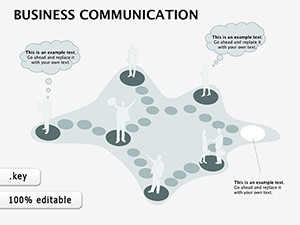
PMs craft swimlane diagrams for task assignments, ensuring accountability in cross-functional teams.
Curious to visualize your data better? Select a template today and witness the difference in your next report.
Layer smart guides for alignment precision, and embed hyperlinks for interactive deep dives. Combine with Keynote`s build effects to unveil layers progressively, maintaining suspense.
These strategies amplify your reports` influence, turning viewers into advocates.
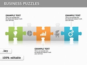
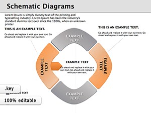
They incorporate relational elements like connectors and hierarchies, offering deeper context than simple bars or lines.
Yes, with guided placeholders and one-click styling, even novices can produce polished visuals.
Keynote supports table imports, allowing real-time updates from spreadsheets.
From finance to nonprofits, any data-heavy field gains from clearer communication.
Use responsive scaling and test via Keynote`s export to PDF.
Built-in paths and fades enhance flow without overwhelming the design.
Empower your reports - start diagramming with confidence.
Copyright © 2009-2026 ImagineLayout All rights reserved.