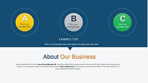
Bring your data to life with our professional relationship PowerPoint chart templates. Perfect for business reports, marketing campaigns, and educational presentations, these charts simplify complex relationships and dependencies. Customize colors, layouts, and labels to make your insights stand out.
From team structures to market connections our templates deliver clarity and visual impact. Save time with pre-designed layouts while impressing your audience with polished charts.
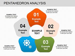
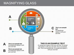
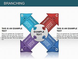
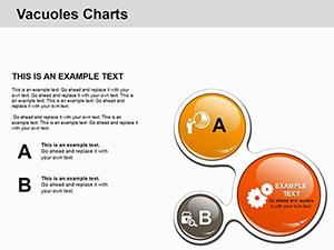
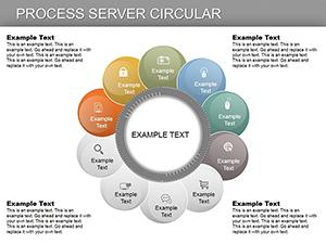
Relationship charts are essential for visualizing connections across projects teams and markets. Unlike standard charts our templates offer advanced layouts like radial and Sankey diagrams with vibrant color coding and scalable vectors.
Real-World Use Cases
Business analysts map client interactions to improve CRM strategies
Educators create interactive charts for classroom learning
Marketing teams visualize campaign touchpoints and ROI
Healthcare professionals illustrate patient care pathways
Benefits Over Default Templates
Pre-configured relationship axes and layouts
Easy Excel integration and automatic data updates
Color-blind friendly palettes and alt-text support
High-resolution export for print or animated slides
Creative Tips and Best Practices
Layer data progressively maintain consistent scaling and use tooltips for interactive charts. Modular designs allow quick swaps for different scenarios. Apply eco-friendly color schemes for sustainable branding or highlight key metrics in pitches.
Download our templates today to create visually engaging charts that communicate insights effectively.
Frequently Asked Questions
Can I edit colors and labels in the charts?
Yes all charts are fully editable including colors labels and layouts.
Are these templates suitable for education?
Absolutely educators can use them for interactive and engaging classroom presentations.
Can I integrate Excel data?
Yes charts support seamless Excel data integration with automatic updates.
Do these charts support high-resolution exports?
Yes export charts in high-resolution for print or animated presentations.
Are they suitable for marketing campaigns?
Yes ideal for mapping campaign touchpoints customer interactions and ROI analysis.