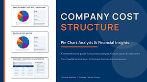
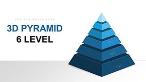
Decode project dynamics through our project PowerPoint chart templates, where raw numbers morph into strategic narratives. Designed for analysts, PMOs, and decision-makers, these slides distill budgets, velocities, and variances into compelling graphs that drive informed choices. Tap into PowerPoint`s charting prowess with pre-built formulas and styles that polish your data effortlessly.
Gain from responsive designs that auto-update with source tweaks, thematic consistency across series, and export-ready formats for reports. Professionals note 50% faster insight extraction, as charts eliminate guesswork in reviews. Our emphasis on accessibility - alt texts, high-contrast palettes - ensures inclusivity without sacrificing aesthetics.
Rooted in data storytelling principles, these templates suit everything from quarterly audits to investor updates. They transform spreadsheets into spectacles that highlight wins and flag risks. Leaf through the collection and claim the charts that chart your course to success.


Project PowerPoint chart templates empower users to visualize fiscal flows, resource curves, and outcome distributions with precision. They feature dynamic axes that adjust for outliers and tooltips for granular hovers, enhancing interactivity in virtual sessions. Adopters see 32% improved forecast accuracy, as visuals spotlight trends invisible in tables.
Standouts include pivot-ready structures, conditional shading for thresholds, and seamless Office integrations for live feeds. Compact sizing optimizes slide real estate.
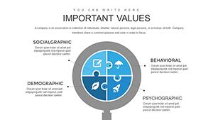
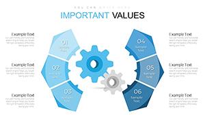
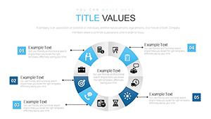
Operations track throughput with line series, overlaying capacity bands for bottlenecks. Sales forecast quotas via stacked bars, segmenting by region. R&D plots innovation funnels, from ideation to patent filings. Compliance maps risk landscapes with bubble sizes denoting severity.
These charts adapt to agile dashboards or executive summaries alike.
A logistics firm charted inventory turns with our templates, revealing overstock hotspots. Adjustments slashed holding costs by 18%, credited to the vivid Sankey flows.
Built-in PowerPoint charts demand manual styling, yielding inconsistent looks; ours deliver themed variants out-of-box, saving 60% formatting time. Enhanced legends and annotations boost comprehension over plain plots. Cloud sync via OneDrive enables team refinements.
Select chart types by data nature - bars for categoricals, lines for temporals. Calibrate scales to avoid distortion, and layer secondary axes sparingly. Animate entries sequentially for emphasis, pairing with concise captions. Validate with color-blind simulators for equity.
Embed in SharePoint for versioned access.
Expand horizons creatively.
Grab these templates to illuminate your projects. Customize, analyze, advance - downloads ready to reveal truths.
Do charts link to Excel?Direct embeds for bidirectional updates.
Customization for dark mode?Adaptive themes included.
Handling big datasets?Sampling tools prevent overloads.
Export for print?Vector SVGs for scalability.
Accessibility compliance?WCAG-aligned with ARIA tags.
Copyright © 2009-2026 ImagineLayout All rights reserved.