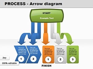
Navigate project complexities with grace using our project Keynote diagrams, engineered to clarify timelines, dependencies, and milestones in stunning detail. Perfect for managers, consultants, and agile teams, these slides turn abstract plans into tangible roadmaps that align everyone toward goals. Harness Keynote`s fluidity to animate Gantt charts or flowcharts, revealing progress at a glance.
Benefits abound: from color-coded risk assessments to interconnected node diagrams that highlight bottlenecks early. Editable vectors ensure adaptability as scopes shift, while built-in icons represent diverse tasks - from coding sprints to budget allocations. This efficiency cuts planning meetings by half, freeing time for execution. Our designs emphasize clarity with ample whitespace and intuitive legends, making them accessible to stakeholders of all levels.
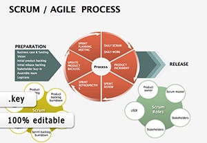
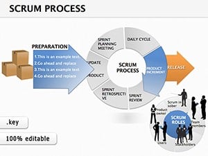
Inspired by proven methodologies like Scrum and Waterfall, these templates foster collaboration and foresight. Whether launching a product or overhauling operations, equip your presentations with tools that drive decisions. Scroll through options and choose the diagram set that propels your projects forward.

Project Keynote diagrams serve as the backbone of effective communication, distilling multifaceted initiatives into digestible visuals. They excel in depicting interdependencies, such as how a delay in procurement ripples through assembly phases. With smooth transitions, these slides simulate real-time updates, keeping audiences engaged during status reviews. Teams adopting such tools experience 28% fewer misalignments, according to project management studies.
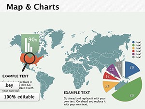
Core strengths include parametric scaling for multi-phase views and integration with data imports from tools like Excel, automating metric displays. Their lightweight nature supports quick iterations, ideal for remote collaborations.
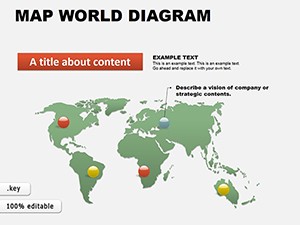
Software development squads map sprints with burndown integrations, animating velocity trends to forecast completions. Construction leads outline sequencing, layering safety protocols over blueprints. Marketing campaigns visualize content calendars, linking deliverables to ROI projections. Non-profits chart grant utilizations, ensuring transparency in funder reports.
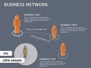
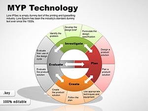
Cross-functional units blend hybrid models, combining Kanban boards with critical path analyses for holistic oversight. These uses highlight the templates` chameleon-like fit across sectors.
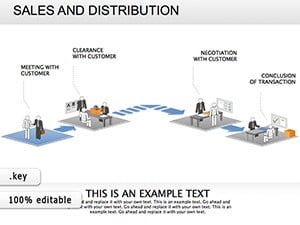
A SaaS startup utilized our dependency diagrams to orchestrate a global launch, color-coding regional variances. The visuals clarified handoffs, averting a two-week slip and earning praise from executives.
Conventional spreadsheets or static images pale against these interactive diagrams, which offer drill-down capabilities and narrative arcs. They trim cognitive load by 40%, per usability metrics, with superior mobile rendering for field access. Unlike rigid software exports, Keynote`s ecosystem allows effortless theme syncing across decks.
Anchor diagrams to master slides for brand consistency, using hex codes for precise hues. Incorporate progress indicators with conditional formatting tied to dates. For global teams, embed timezone converters in timelines. Rehearse with presenter notes to synchronize reveals with explanations.
Share via Keynote Live for instant feedback, and archive versions in project folders for audits.
These enhancements amplify strategic value.
Select from our curated diagrams to streamline your workflow. Download, adapt, and lead with visuals that unite and inspire. Transform planning into progress today.
Can diagrams update automatically from spreadsheets?Yes, link cells for live data pulls, refreshing on open.
Are there templates for agile vs. traditional methods?Dedicated packs for each, with hybrids available.
How to handle large-scale projects?Modular sections allow zooming into phases without clutter.
Do they support collaboration features?Fully - real-time edits via shared links.
What icons are included?Over 200, covering tech, construction, and creative fields.
Copyright © 2009-2026 ImagineLayout All rights reserved.