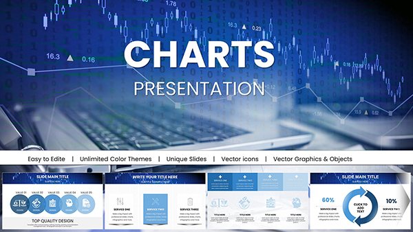
Keynote chart templates revolutionize how you present numbers, turning raw data into narrative gold. Suited for analysts, executives, and educators, they simplify complex stats with intuitive designs that Keynote handles flawlessly.
From bar graphs to pie charts, our templates include varied styles - minimalist lines or vibrant 3D renders - ready for your inputs. Animate data points to build drama, revealing trends that captivate.
These tools address the common pain of dry spreadsheets, injecting life into reports and forecasts. Achieve clarity that drives decisions, all while maintaining a sleek, Apple-polished aesthetic.
Chart your course - browse Keynote chart templates and illuminate your data today.
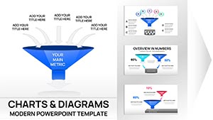
Charts in Keynote aren`t just visuals; they`re storytellers that contextualize figures for impact. Our templates come pre-formatted with axes, legends, and labels, accelerating your workflow.
Sales teams track quarterly performance with line charts showing upward trajectories. Researchers visualize survey results via stacked bars. The magic lies in Keynote`s real-time updates - tweak source data, watch charts refresh.
Basic charts often lack flair; ours add gradients and shadows for professional depth.
In finance, candlestick charts forecast market shifts. Healthcare dashboards use heat maps for patient metrics. E-commerce reviews trends with donut charts for quick scans.
These applications transform data overload into focused narratives, sparking discussions and strategies.
Empower your team with visuals that reveal patterns at a glance.
Select chart types wisely: Bars for comparisons, lines for changes over time. Limit categories to five for readability. Use annotations to spotlight key figures.
Keynote`s formula editor links to Numbers for dynamic sourcing. Test on different displays for color accuracy.
Golden Rule: Less is more - declutter to highlight essentials.
Engineered for Keynote`s interactivity, they support drill-downs and filters. Compact file sizes ensure smooth performance in large decks.
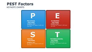
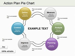
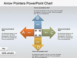
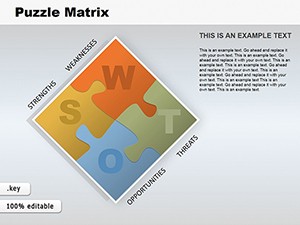
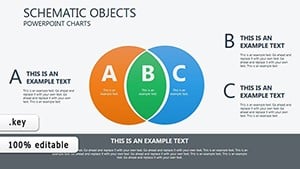
Specialized options like Gantt or radar charts cater to pros, beyond generic fare.
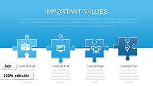
Combine charts with shapes for hybrid infographics or animate series for sequential reveals. Innovate to engage uniquely.
Decode your data - pick a chart template and present with power!
Master data presentation with Keynote charts. Your insights deserve the spotlight - get started.
Copyright © 2009-2026 ImagineLayout All rights reserved.