Bring your data to life with our specialized Keynote chart templates, engineered to transform numbers into compelling narratives. These products are essential for anyone presenting analytics, forecasts, or insights in a visually engaging format.
Tailored for Apple`s Keynote, the templates include a variety of chart types - from bar graphs to pie diagrams - each with editable axes, labels, and animations. Professionals in finance, marketing, and research will find them invaluable for creating slides that clarify trends and support decisions.
Experience the ease of drag-and-drop customization that keeps your focus on storytelling, not technical tweaks. Our chart products deliver precision and style, ensuring your presentations resonate with clarity and confidence. Dive in and elevate your data displays today.
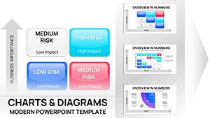
Our Keynote chart templates redefine how you handle information overload, offering pre-built structures that adapt to your dataset seamlessly. Unlike stock charts that lack flair, these incorporate thematic consistency, interactive elements, and color-coded schemes for instant comprehension.
Use them in board meetings to illustrate sales funnels or in academic settings to depict research findings. Consultants can deploy radial diagrams for process overviews, while teams use Gantt-style timelines for project tracking. The edge over defaults? Advanced layering for multi-series data and built-in legends that update automatically.
Spotlight on "Analytics Pro" template: A suite of 20+ charts for market analysis, complete with trend lines and forecasts. For creative twists, "Infographic Flow" blends charts with icons for holistic overviews. These tools empower users to iterate rapidly, testing variations to find the most persuasive layout.
In healthcare, visualize patient trends with stacked area charts; in e-commerce, funnel diagrams track conversion paths. Our templates support real-time updates, ideal for live demos. Users often note a 50% reduction in audience confusion when switching to these dynamic visuals.
Eager to chart your success? Select from our range and integrate powerful data stories into your next Keynote presentation.
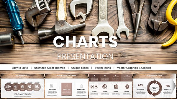
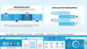
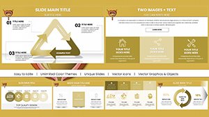
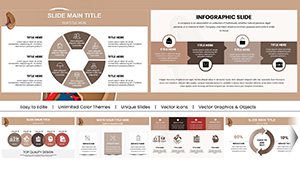
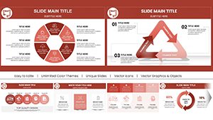
From line and bar to radar and bubble, covering essentials for diverse data needs.
Yes, every data point, style, and animation is customizable without external software.
Directly - copy-paste functionality ensures smooth integration with spreadsheets.
Certainly, with build sequences that reveal data progressively for dramatic effect.
Packs vary from 10 to 30, providing comprehensive coverage for most projects.
All charts scale responsively for iPad and iPhone presentations.
Turn numbers into narratives that captivate. Grab a Keynote chart template and make your data shine.
Copyright © 2009-2026 ImagineLayout All rights reserved.