Empower presentations with process diagram templates for PowerPoint, turning abstract sequences into concrete visuals. Aimed at executives, trainers, and analysts, these aid in dissecting operations for better outcomes.
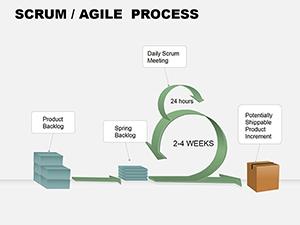
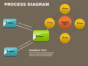
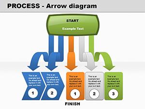
Encompassing linear flows, hierarchical trees, and radial hubs, the designs accommodate everything from sales funnels to quality controls. Refine in PowerPoint with ease, adding dynamics like morph transitions for fluid storytelling.
They transform routine updates into riveting sessions, highlighting efficiencies and opportunities alike.
Propel your points - view process diagrams today.
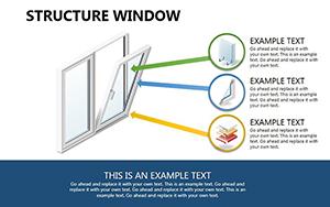
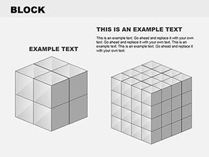
PowerPoint`s SmartArt suffices for simples, yet falters on nuance; our templates counter with precision connectors, bevel effects, and data-driven sizing for proportional accuracy.
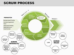
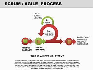
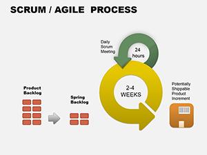
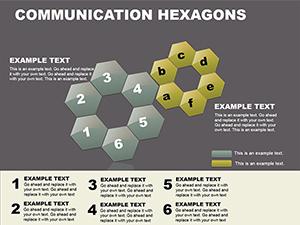
Key offerings: Branching logic symbols, progress bars for status, and embeddable tables for metrics alongside paths.
This polish elevates diagrams to strategic tools.
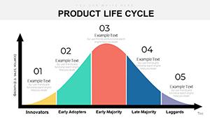
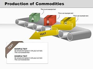
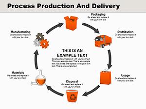
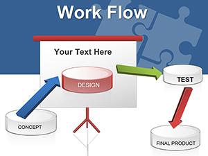
Diagrams clarify in boardrooms and field reports. Sales directors illustrate lead nurturing, with funnel shapes widening at conversion stages to underscore tactics.
For lean initiatives, sequential diagrams expose waste points, guiding optimizations collaboratively.
Trainers build compliance paths, using color-coded risks to instill protocols memorably.
Leaders chart digital transformations, layering tech integrations over core processes for forward vision.
Trumping defaults, ours enable conditional visibility; counsel: Use shadows for depth in 3D views, but sparingly to avoid distraction.
Combine with Venns for overlapping processes or timelines for phased views. Ingenious: Leverage morphing to evolve diagrams mid-presentation, simulating real-time changes.
Anchor in outcomes - initiate with goals to frame the process retrospectively.
Orchestrate clarity - download process diagrams and advance assuredly.
Resolving process diagram questions for PowerPoint.
Copyright © 2009-2026 ImagineLayout All rights reserved.