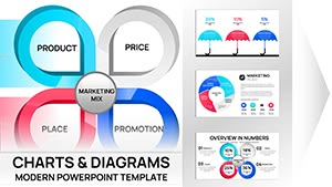
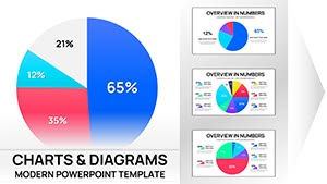
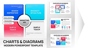
Navigate the intricacies of marketing strategies with our specialized Keynote chart templates. Tailored for process visualization, these designs break down customer journeys, campaign timelines, and performance metrics into clear, actionable graphics. Marketers, consultants, and business leaders will appreciate how they simplify storytelling, turning data overload into digestible insights.
Built with vector-based charts that scale perfectly, each template supports easy data import from spreadsheets. Customize colors to align with your brand palette, and add interactive elements for deeper engagement during pitches or team reviews. The focus on flowcharts and Sankey diagrams ensures your audience grasps the big picture at a glance.
Whether mapping out lead generation stages or ROI projections, these tools empower precise communication. Browse our selection and select templates that fit your workflow - professional results await with just a few clicks.


Unlike default Keynote charts, which often lack thematic cohesion, our templates integrate process-specific icons and connectors for a polished look. They handle complex interconnections - like multi-channel attribution - without clutter, using grouped elements that edit as units. This saves hours in formatting, letting you iterate faster on strategy refinements.
For instance, a funnel chart template auto-adjusts segments based on your input, visualizing drop-off rates with gradient fills for emphasis. Teams report 50% quicker prep times, freeing energy for creative brainstorming.
In digital marketing, deploy timeline charts to outline content calendars, highlighting milestones with milestone markers. Content creators use process maps to illustrate editorial workflows, from ideation to publication, fostering collaborative edits.
Sales enablement benefits too, with pipeline charts that mirror CRM data for forecast discussions.
Start by defining your process endpoints - inputs at the top, outcomes at the bottom - for logical flow. Use consistent line weights and node sizes to avoid visual noise; opt for sans-serif fonts in chart labels for screen readability. Integrate live data links if presenting virtually, updating charts in real-time.
Enhance with color coding: blues for planning phases, greens for execution, reds for review. Test narratives by rehearsing: does the chart alone convey the message? Adjustments here amplify clarity.
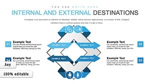
Picture a B2B firm using a swimlane template to delineate roles in a product launch process - each lane a department, arrows showing handoffs. Or, e-commerce brands mapping omnichannel experiences, revealing friction points via bottleneck highlights.
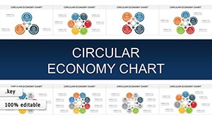
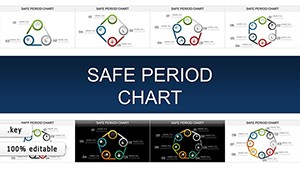
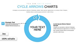
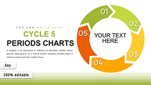
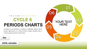
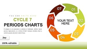
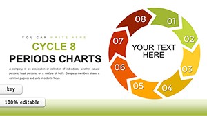
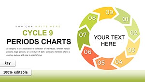
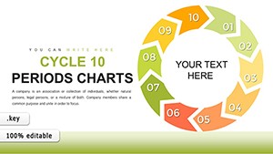
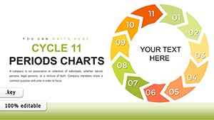
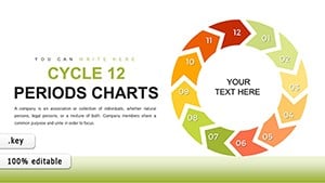
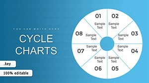
Our 40+ templates cover linear to cyclical processes; pick one, populate with your metrics, and iterate. They`re vector-optimized for crisp prints or digital shares.
Transform your next strategy session - download a template and chart your path to success today.
They distill multifaceted processes into visual stories, making abstract strategies tangible and easier for stakeholders to approve or refine.
Yes, copy-paste functionality supports seamless integration, with auto-formatting to match template styles.
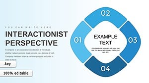
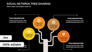
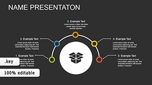
From customer acquisition funnels to A/B testing workflows, including timelines, matrices, and decision trees.
Absolutely - scalable vectors allow expansion from simple 3-step to detailed 20+ node diagrams without quality loss.
Yes, build-in sequences reveal steps progressively, ideal for guided walkthroughs in live sessions.
Global theme editors let you swap colors, fonts, and icons in one go, ensuring on-brand consistency.
Copyright © 2009-2026 ImagineLayout All rights reserved.