Turn complex data into clear visual stories with our PowerPoint chart templates. This collection brings together professionally designed slides that help you present numbers trends and comparisons with confidence. Whether you are preparing a quarterly business report marketing analysis or academic presentation these ready to use charts save hours of formatting and design work.
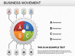
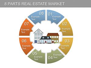
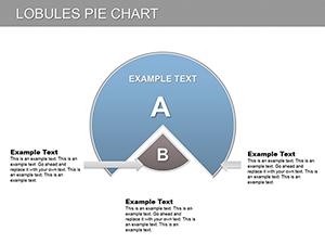
Choose from bar charts pie charts line graphs area charts process diagrams and mixed data layouts. Each slide is fully editable so you can quickly adjust colors values labels and layouts to match your brand. Instead of struggling with default designs you get polished visuals that look modern structured and presentation ready from the first slide.
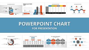


Data is powerful only when it is understood. Standard built in charts often look basic and lack visual impact. Our PowerPoint chart templates are designed to help you communicate insights clearly while maintaining a clean professional appearance.
Each template focuses on readability balance and visual hierarchy. Titles are strategically placed legends are easy to follow and data points are highlighted to guide audience attention. This ensures your message is not lost in cluttered slides.
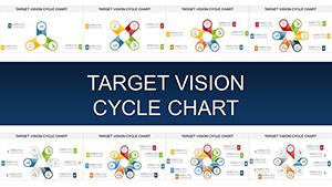
These chart templates are created for practical everyday presentation needs across industries.
Present quarterly revenue growth sales performance cost analysis or KPI dashboards. Use column and line charts to highlight trends over time and comparison charts to show department performance. Professional visuals help decision makers quickly understand results.
Show campaign performance website traffic engagement metrics or customer segmentation. Pie charts and bar graphs simplify audience data while combined layouts allow you to compare multiple channels in a single slide.
Teachers and students can use these slides to present research findings survey results or statistical comparisons. Clean chart layouts support clarity during lectures thesis defenses and conference presentations.
Investors expect clear metrics. Use modern data slides to demonstrate market size revenue projections and traction. A structured visual presentation builds credibility and trust.
While PowerPoint includes built in chart tools they often require manual styling to look professional. Our templates provide:
Instead of adjusting fonts lines and alignments manually you start with a polished foundation and focus only on your data and message.
Remember that a chart should support your narrative not replace it. Keep slides focused and guide viewers step by step through the data.
Explore the collection and choose the layout that fits your goals. Download your preferred PowerPoint chart template today and transform raw numbers into persuasive visual stories. Professional data slides make every presentation more confident and impactful.
Yes all charts and design elements can be edited including values colors labels and fonts. You can easily adapt them to your brand and presentation needs.
Yes they are suitable for business meetings client reports marketing presentations and internal corporate use.
No the templates are created for easy editing. You can simply replace sample data with your own and adjust colors if needed.
The collection includes bar charts line graphs pie charts area charts comparison diagrams and mixed data layouts for various presentation scenarios.
Copyright © 2009-2026 ImagineLayout All rights reserved.