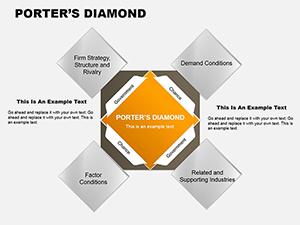
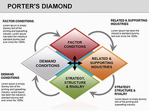
Empower your strategic toolkit with Porter`s Diamond diagrams designed for PowerPoint. This proven model illuminates competitive forces via a diamond-shaped layout, encapsulating essential drivers of industry success.
For business developers, policymakers, and scholars, these diagrams offer a structured canvas to plot factors like human resources and competitive intensity. Easily modify shapes, add data labels, and apply themes for brand fit.
Crafted for clarity with vector precision and subtle shadows for depth, they suit everything from executive summaries to thesis defenses. Uncover hidden opportunities - select a diagram and diagram your path to excellence today.
Diplomats diagram trade negotiations, emphasizing government roles in factor enhancement. Retail chains assess overseas sourcing, diagramming supplier clusters against local demands.
Innovation hubs use them for cluster mapping, fostering collaborations in biotech corridors. Media firms analyze content industries, linking creativity with market sophistication.
Franchisors diagram expansion viability, adjusting for cultural chance events, ensuring sustainable growth models.
PowerPoint`s shape library yields amateurish results without our model`s guided structure, which includes preset interconnections and scaling logic. This precision saves hours, delivering diagrams that impress discerning viewers.
Advanced layering allows phased complexity, unlike flat defaults, for narratives that unfold compellingly.
Qualities: Smart connectors that auto-adjust, icon libraries for factors, and schema-ready exports. UVPs lie in modularity - mix with other slides seamlessly.
Hacks: Embed hyperlinks to sources, use glow effects sparingly for emphasis, and version control via slide masters. For aerospace, diagram Boeing`s Washington cluster, spotlighting R&D and suppliers.
Nike`s sportswear diagram highlights Oregon`s design demand, inspiring supply chain tweaks. Vary for services: Add digital nodes for e-commerce diamonds, evolving the classic form.
These variations extend utility, from war rooms to white papers, consistently clarifying complexities.
Diagram your success story? Acquire a template and strategize with impact.
Essentials for Porter`s Diamond PowerPoint diagrams:
Link to chart assets for enriched analyses.
Copyright © 2009-2026 ImagineLayout All rights reserved.