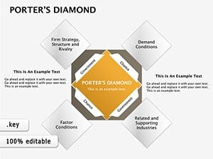
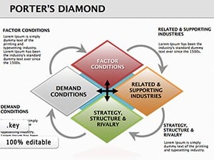
Delve into competitive strategy with our Porter`s Diamond diagrams tailored for Keynote users. This framework, developed by Michael Porter, dissects national and industry advantages through four key factors: factor conditions, demand conditions, related industries, and firm strategy.
Perfect for consultants, academics, and corporate planners, these diagrams simplify complex analyses into clear, interactive visuals. Animate elements to reveal insights progressively, making sessions more dynamic and memorable.
Our templates feature elegant designs with color-coded segments, editable text fields, and scalable vectors for any screen size. Whether mapping a country`s export strengths or a firm`s market position, these tools empower precise, persuasive presentations. Explore now and sharpen your strategic edge.
Porter`s Diamond diagrams are invaluable for dissecting competitive landscapes in international business. Governments use them to evaluate policy impacts on industries, like assessing tech sector growth in emerging markets. Consultants apply the model to advise clients on expansion strategies, identifying leverage points in global supply chains.
In academia, professors illustrate economic theories, helping students grasp how rivalry and supporting sectors interplay. Non-profits analyze sustainable development, linking environmental factors to economic viability.
Executives deploy these diagrams in board meetings to benchmark against competitors, using the two additional factors - chance events and government influence - for comprehensive views. This fosters informed debates on diversification or localization.
Standard Keynote diagrams lack the specificity of Porter`s model, often resulting in cluttered or incomplete representations. Our templates address this with pre-structured diamonds, integrated icons for each determinant, and built-in annotations, reducing setup time significantly.
They outperform basics by supporting layered views - start with core elements, then overlay externalities - enhancing depth without overwhelming slides. Users appreciate the professional polish that generic shapes can`t match.
Standout UVPs include hyperlinked sections for drill-down details, theme-consistent styling, and export to PDF for reports. These ensure diagrams not only inform but also engage, turning static analysis into interactive tools.
Tips for best results: Populate with real data early, use contrasting colors for factors, and sequence reveals to build arguments logically. For a wine industry case, animate demand conditions first to underscore consumer tastes` role in French dominance.
Consider BMW`s use of the model to analyze automotive clusters in Germany - diagrams revealed skilled labor and supplier networks as keys to superiority. Creatively, adapt for tech: Map Silicon Valley`s ecosystem, adding digital icons for modern relevance.
In education, a comparative diagram juxtaposes Japan`s electronics vs. U.S. software, sparking classroom discussions on adaptability. These examples show how templates adapt to diverse contexts, inspiring innovative applications.
Elevate your strategy talks? Select a diagram template and start analyzing today.
Insights on Porter`s Diamond diagrams for Keynote:
Pair with chart templates for deeper data integration in your strategies.
Copyright © 2009-2026 ImagineLayout All rights reserved.