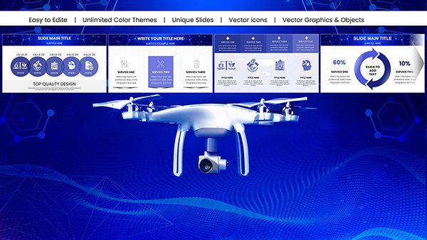
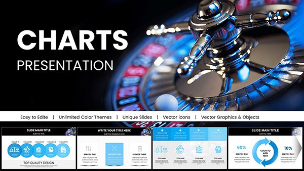
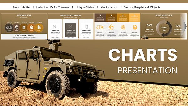
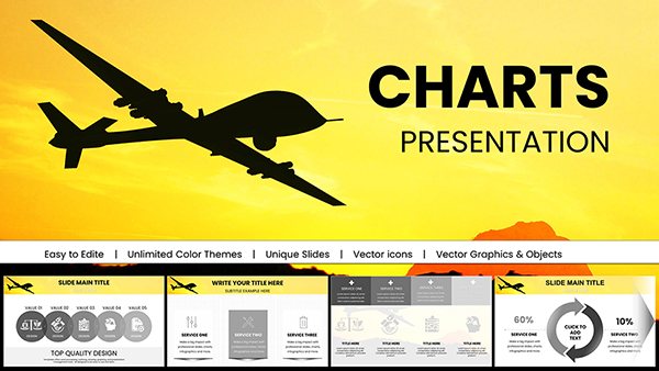
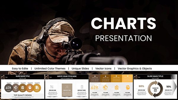
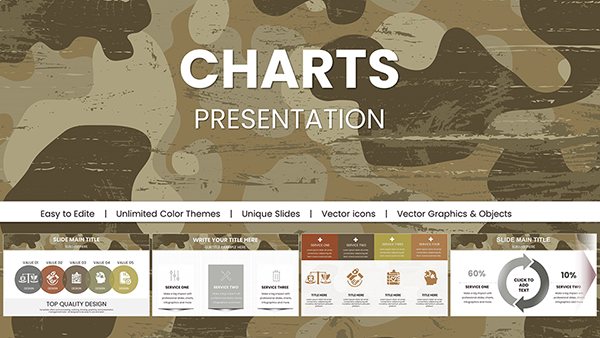
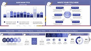
Bring your planning data to life with Keynote chart templates that capture Apple`s signature polish. Geared toward creatives, strategists, and educators who appreciate seamless integration, these templates make complex metrics accessible and aesthetically pleasing.
From interactive pie charts revealing budget breakdowns to sleek area graphs tracking initiative growth, our designs leverage Keynote`s fluid animations for engaging reveals. Effortlessly tweak colors, fonts, and data points to align with your vision, ensuring every slide reflects sophistication.
Experience the joy of planning presentations that not only inform but enchant - boost comprehension and spark discussions with visuals that feel as intuitive as they look.
Inspire with data: Scroll through options and find the perfect chart for your narrative.
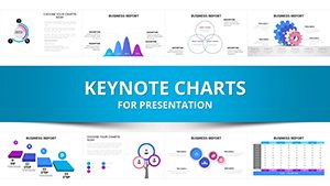
Keynote chart templates in our collection harness the platform`s native strengths, like cinematic transitions, to make planning data unforgettable. They surpass basic inserts by offering layered builds that unveil insights progressively, ideal for narrative-driven sessions where pacing matters.
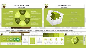
Enthusiasts note how these templates cut prep time in half, allowing focus on strategy over styling. A treemap chart, for example, nests planning categories hierarchically, using size and hue to prioritize - perfect for portfolio reviews.
Such versatility suits creative agencies, academic planners, and beyond, turning data into dialogue starters.
Keynote`s defaults, while solid, lack the bespoke flair for branded planning. Our templates include theme-aware variants, auto-syncing with your master design, and export-ready formats for cross-platform sharing - eliminating reformatting hassles.
Advanced features like data-driven animations respond to values, e.g., expanding bars for growth highlights, adding dynamism absent in stock options.
These steps ensure charts enhance, rather than eclipse, your planning message.
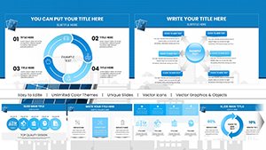
Designer Mia used our column chart for campaign ROI, with rising animations mirroring success arcs - her pitch secured funding swiftly. This illustrates templates` persuasive power.
In education, stock charts simulate market planning exercises, fostering hands-on learning. For nonprofits, polar area charts depict donor distributions, optimizing outreach.
Innovate by blending charts with Keynote`s magic move for seamless scene shifts in multi-phase plans.
Tip for Flair: Subtle glow effects on peaks draw eyes to triumphs.
Download a Keynote chart template and let your data dazzle.
Which charts suit Keynote`s style best? Minimalist lines and bars complement its clean aesthetic.
Do they import from Excel smoothly? Yes, with drag-and-drop preserving formulas.
Are charts optimized for iPad? Touch-friendly controls ensure on-the-go edits.
How to add custom shapes to charts? Overlay via build order for unique accents.
Can I share with PowerPoint users? Export as PDF or video for universal access.
What`s unique about Keynote animations? Fluid, device-accelerated effects for pro-level polish.
Copyright © 2009-2026 ImagineLayout All rights reserved.