Pivot charts let you explore data from multiple angles without rebuilding slides. Our collection of over 50 pivot-style chart templates for Keynote makes it easy to create flexible, professional summaries that adapt to your message.
Designed to mimic the power of pivot tables visually, these templates feature clean layouts, smart color coding, and smooth transitions.
Fully customizable and animated, they`re perfect for analysts, managers, and anyone who needs to present summarized data clearly.
Save time and impress stakeholders with charts that feel interactive and insightful.

Pivot charts help you answer new questions on the fly by changing categories, filters, or measures. Our templates bring that flexibility to Keynote with pre-built variations that look polished and professional.
Default charts require manual rebuilding for each perspective - our templates eliminate that work.
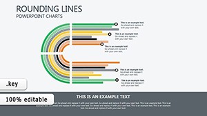
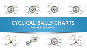
Switch between regions, products, or time periods instantly.
Compare actual vs. budget by department or category.
Pivot between channels, campaigns, or audience segments.
Analyze headcount, turnover, or performance by team or location.
Find the pivot chart that matches your data story and download it now.
These practices ensure your audience follows the shifts without confusion.
Combine pivot views with icons or small sparklines. Use separate slides linked by hyperlinks for deeper exploration. Create dashboard-style summaries with multiple small pivot charts on one slide.
Start building smarter presentations - choose a template today.
They include multiple pre-configured views in one file, allowing quick switches between dimensions without redesign.
Yes - data fields are clearly marked and editable in seconds.
Yes, smooth build-ins and transitions between different pivot views.
Yes, several free options are included in the collection.
Copyright © 2009-2026 ImagineLayout All rights reserved.