Present proportions and percentages with confidence using our extensive collection of pie chart diagrams for Keynote. These templates transform raw numbers into visually compelling stories that audiences grasp instantly.
Move beyond basic pie charts with sophisticated designs featuring 3D effects, creative segment styling, animations, and multiple layout variations. Every template is completely editable, so you can update data, colors, and labels in seconds.
Designed for clarity and impact, these modern diagrams follow current best practices while offering creative options for when you want to stand out. Ideal for analysts, managers, educators, and marketers who need to communicate part-to-whole relationships effectively.
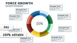


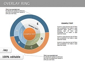
Pie charts excel at showing simple proportions - typically 5-7 segments maximum. They're perfect for market share, budget allocation, survey results, or demographic breakdowns where visual impact matters.
Our designs avoid common pitfalls like overcrowded segments or poor color choices. They include features like pull-out segments, percentage labels, and smooth animations that make data reveals more engaging.
Make your data speak clearly and beautifully. Browse our complete pie chart diagram collection and download the ideal templates for your next presentation!
Simply select the chart and edit the data table - changes reflect instantly in the visual.
Yes, we offer both flat and 3D variations for different visual impacts.
Most templates include automatic percentage and value labels that update with data changes.
Yes - many templates include pre-built options for pulling out segments for emphasis.
Yes, we offer free options alongside premium designs.
Copyright © 2009-2026 ImagineLayout All rights reserved.