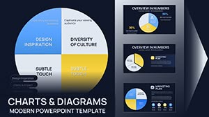
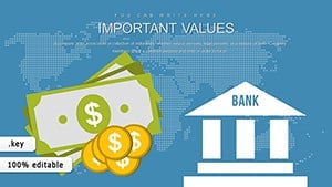
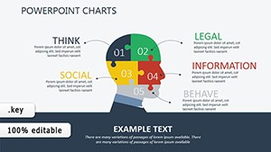
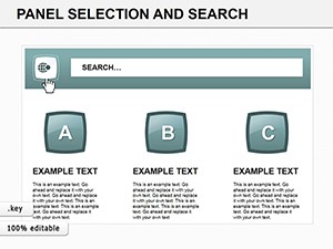
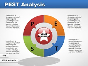
Empower your strategic discussions with PEST chart templates optimized for Keynote, blending Apple`s design elegance with robust analytical frameworks. For business analysts, policymakers, and educators, these templates dissect Political, Economic, Social, and Technological landscapes into visually compelling stories.
Leverage Keynote`s smooth builds to unveil factors progressively, engaging stakeholders in meaningful dialogues. Customizable quadrants, thematic icons, and fluid transitions make complex data approachable and memorable.
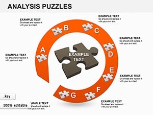
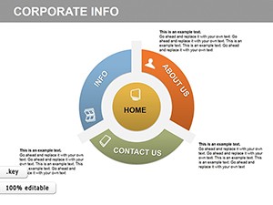
Extend to PESTLE for fuller scans, all within an intuitive editing environment. Whether for workshops or executive briefings, these tools clarify paths forward. Explore our selection and turn environmental scans into strategic advantages today.


Our Keynote PEST templates capitalize on magic moves for interconnected factor flows and shape morphing for evolving trends, creating immersive analytical experiences. Retina-ready graphics and iCloud integration facilitate seamless sharing across devices.
Teams report accelerated decision-making, crediting the templates` clarity.
Proven in high-stakes scenarios.
Generic charts in Keynote feel static; ours add narrative depth with timed reveals and customizable narratives, transforming data dumps into dialogues. Enhanced with accessibility labels for inclusive presentations.
Support for multiple languages aids international strategy sessions.
Refine for precision.
A policy think tank visualized Brexit impacts, swaying key stakeholders with phased reveals, leading to influential reports. Educators use them for global studies, fostering critical thinking through interactive elements.
Integrate with mind maps for holistic views or timelines for historical contexts.
Strategize with style - grab Keynote PEST templates and illuminate strategies.
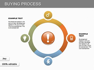
Combine with SWOT overlays for integrated planning, or use color gradients to denote risk levels. For virtual meetings, screen-sharing optimizations prevent lag.
In non-profits, they map donor trends, optimizing campaigns effectively.
Embed hyperlinks to sources or videos for evidentiary support, enriching your analyses comprehensively.
Visualize victory. Download now and strategize brilliantly.
Copyright © 2009-2026 ImagineLayout All rights reserved.