Craft mesmerizing data visuals using our percentage diagram templates for Apple Keynote. These refined designs make percentages pop, ideal for strategic overviews, financial summaries, or trend analyses.
For executives, designers, and educators seeking sophistication, they blend seamlessly with Keynote`s fluid animations. Effortlessly adjust to fit your narrative.
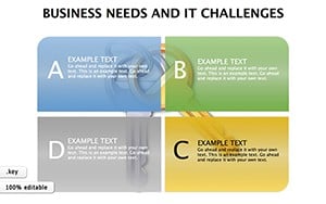
From concentric circles to segmented arcs, discover templates that elevate every slide.
Inspire with data? Peruse our Keynote percentage diagram templates today.

Keynote`s smooth transitions pair perfectly with percentage diagrams, creating fluid data reveals. They simplify stats interpretation, crucial for boardrooms or lectures.
Financial pros map budgets, marketers dissect audiences - adaptability is key.
More intuitive than stock options, with built-in scalability. Pro tip: Sync with iCloud for team edits.
Incorporate shadows for depth or magic move for morphing shapes. For fun, theme around holidays with festive fills.
Precise controls ensure pixel-perfect alignment. Teams value the collaboration-ready format.
Swift sophistication. Try outline modes for minimalist looks.
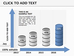
Animated data retains 65% more info. Add voiceover triggers for guided tours.
Built-in accessibility for inclusive designs.
Unlock elegant insights - secure your Keynote templates now.
Refine your Keynote craft with these gems. Start transforming data into art.
Copyright © 2009-2026 ImagineLayout All rights reserved.