Percentages Keynote Charts
Infuse energy into your Keynote decks with percentage chart templates that dazzle. Tailored for dynamic storytelling, they highlight trends, allocations, and achievements with vibrant, animated flair.
Perfect for sales teams, researchers, and speakers, these charts adapt to any theme while maintaining clarity. Animate to reveal insights progressively.
Select from bold pies to sleek meters - each crafted for Keynote excellence.
Chart your story? Browse Keynote percentage charts and captivate.
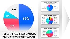
Pie Charts Keynote Template - Fully Editable | Instant Download
ID: #KC01100
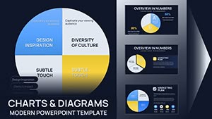
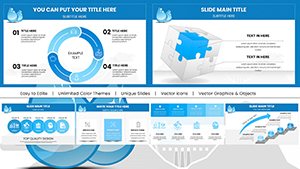
Pie Charts Keynote Template - 26 Fully Editable Slides | Instant Download
ID: #KC01094
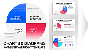
Keynote Pie Chart Template - 26 Fully Editable Slides | Instant Download
ID: #KC01070
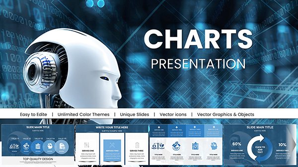
AI-Powered Robot Charts Template: Fuel Your Tech Visions with Futuristic Flair
ID: #KC01054
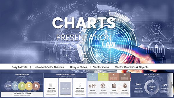
Professional Law Charts Keynote Presentation Template
ID: #KC01031
Professional Dental Implant Charts Keynote Template
ID: #KC01025
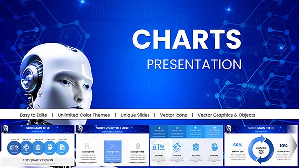
AI Keynote Presentation Templates with Robot AI Charts
ID: #KC01020
Data Visualization Keynote Charts Template: Illuminate Your Insights
ID: #KC01017
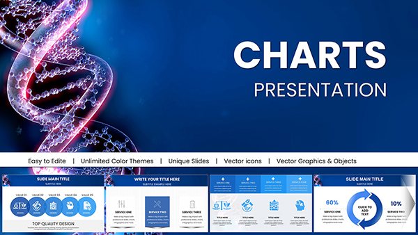
Medicine DNA Genome Keynote Charts: Empower Genomic Narratives
ID: #KC01016
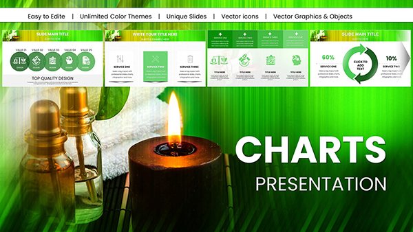
Spa Procedures Keynote Charts: Revitalize Your Wellness Talks
ID: #KC01015
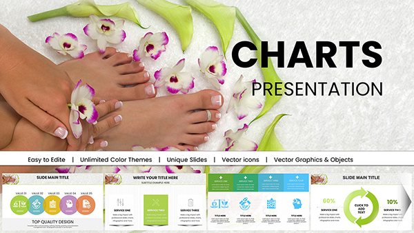
Spa Treatments Keynote Charts for Spa Presentation
ID: #KC01011
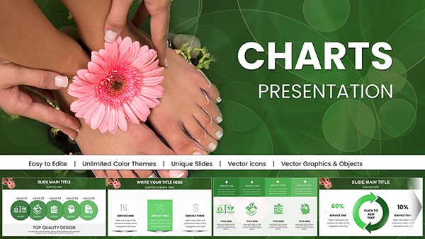
SPA Foot Charts for Keynote Presentation
ID: #KC01010
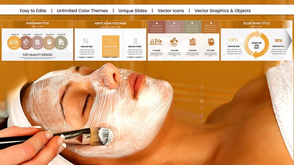
DIY Face Mask Spa Charts for Keynote: Beauty & Wellness Mastery
ID: #KC01005
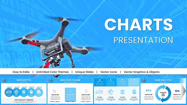
Drone Commercial Keynote Charts for Presentation
ID: #KC00998
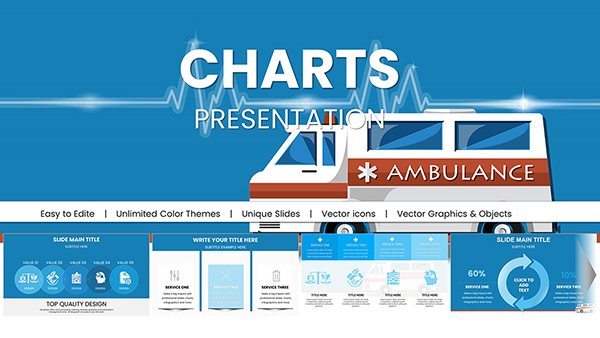
Design Ambulance Keynote Charts Template: Revolutionize Your Medical Visuals
ID: #KC00975
Eco Sustainable Keynote Charts Template: Green Visuals for a Better Tomorrow
ID: #KC00967
Future Solar Energy Keynote Charts Template Presentation
ID: #KC00966
Hydropower Energy Keynote Charts Template for Presentation
ID: #KC00965
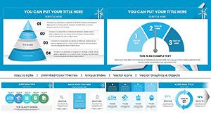
Powerful Wind Energy Keynote Charts Template
ID: #KC00964
Sales Analysis Keynote Charts - Fully Editable | ImagineLayout
ID: #KC00695
Professional Keynote Charts - Fully Editable | ImagineLayout
ID: #KC00567
Customizable Corporate Keynote Organizational Charts
ID: #KC00525
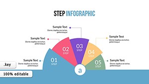
Step and Cycle Infographic Keynote Template: Map Processes with Elegance
ID: #KC00493
TOP Creative Keynote Charts: Inspire Innovation
ID: #KC00488
Power of Percentage Charts in Keynote These charts turn numbers into narratives, leveraging Keynote`s physics-based animations for immersive reveals. Essential for data-heavy talks.
Sales visualize quotas, researchers plot findings - universal utility.
Practical Scenarios Sales Pitches: Funnel charts for conversion rates.Research Summaries: Stacked bars for variable impacts.Team Reviews: Gauges for performance scores. Outpace basic inserts with thematic icons. Advice: Cap segments at five for focus.
Enhancing Charts Creatively Overlay textures for tactile feel or path animations for sweeping effects. Innovate with eco-themes for sustainability reports.
High-fidelity rendering for 4K displays. Remote workers appreciate shareable links.
Setup Guide Place chart on slide. Populate with data. Configure action builds. Harmonize with master. Simulate run-through. Effortless vibrancy. Experiment with particle effects for flair.
Amplifying Message Retention Visual charts lift recall by 55%. Integrate AR previews for next-gen appeal.
Screen reader friendly out-of-box.
Animate your analytics - claim Keynote chart templates today.
Frequently Asked Questions Empower your Keynote visions. Our charts await your touch.