Master the 80/20 principle with our dedicated collection of Keynote Pareto chart templates. Perfect for quality improvement, process optimization, customer feedback analysis, and strategic prioritization.
Over 50 specialized Pareto designs combine bar and cumulative line charts with clear labeling, percentage markers, and cutoff lines - all following classic and modern Pareto conventions.
Updated for with clean aesthetics, optional color themes, and smooth animations that reveal the vital few dramatically.
Focus attention on what truly matters in your data.
Corporate Social Responsibility Keynote Charts: Visualize Impact and Ethics Effortlessly
ID: #KC00780
$22.00
(1177)
Interconnected Insights: 7-Period Cycle Keynote Charts for Closed-Loop Processes
ID: #KC00766
$18.00
(87)
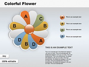
Edible Flower Keynote Charts: Bloom Your Data Presentations
ID: #KC00125
$18.00
(830)
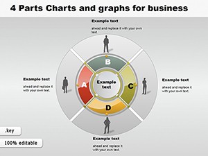
4 Parts Pie and Graphs Business Keynote Charts
ID: #KC00118
$28.00
(540)
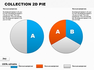
Essential 2D Pie Keynote Charts: Slicing Architectural Data with Precision
ID: #KC00108
$22.00
(742)
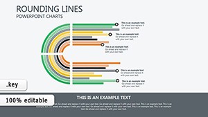
Dynamic Rounding Lines Keynote Charts: Weaving Architectural Timelines with Grace
ID: #KC00106
$7.99
(627)
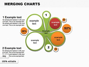
Infographic Merging Keynote Charts: Weave Data into Cohesive Narratives
ID: #KC00102
$8.00
(1162)
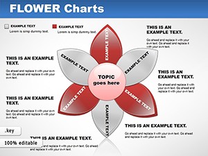
Flower Keynote Charts: Bloom Your Data
ID: #KC00048
$22.00
(124)
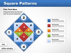
Square Patterns Keynote Charts Template: Creative and Professional Designs
ID: #KC00043
$18.00
(761)
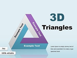
3D Triangles Keynote Charts: Depth and Clarity in Every Angle
ID: #KC00029
$26.00
(925)
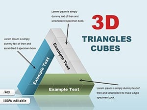
3D Triangles and Cubes Keynote Charts: Elevate Data to New Dimensions
ID: #KC00028
$26.00
Power of Pareto Analysis
A well-designed Pareto chart instantly shows which factors contribute most to a problem or opportunity. Our templates ensure proper sorting, accurate cumulative percentages, and visual separation between the vital few and trivial many.
Typical Applications
Quality Improvement & Six Sigma
Identify top defect causes, complaint types, or process variations.
Customer Experience & Support
Prioritize issues based on frequency or impact from customer feedback.
Sales & Product Management
Focus efforts on top-performing products, customers, or channels.
Best Practices for Pareto Charts
Sort categories descending by impact
Include the 80% cutoff line when relevant
Use contrasting colors for bars vs. cumulative line
Limit categories to 8-12 for readability
Drive better decisions with clear visuals - explore our Pareto chart templates and download the perfect design for your analysis.
Frequently Asked Questions
Do templates automatically calculate cumulative percentages?
Yes, data tables include formulas for correct cumulative line generation.
Is the 80% cutoff line included?
Most templates feature an optional reference line at 80%.
Can I combine multiple Pareto charts for before/after?
Yes, many sets include paired templates for improvement tracking.
Are different styling options available?
Yes - classic, modern minimal, and branded color variations.