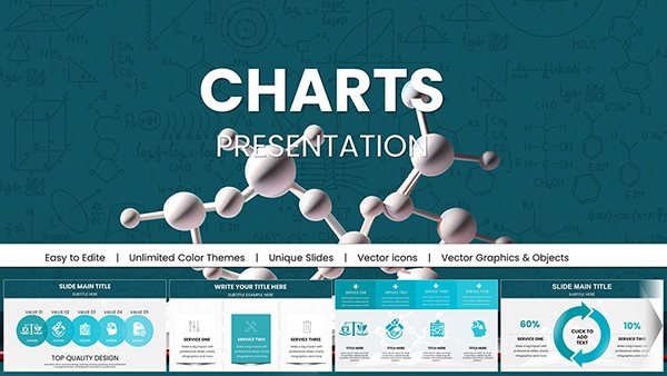
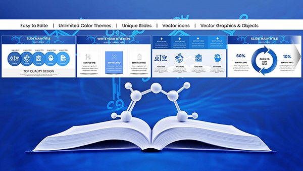
Bring your organizational data to life with our specialized Keynote charts templates, crafted for Apple users who demand precision and style. Ideal for executives, analysts, and educators, these templates turn raw numbers into engaging narratives that drive decisions.
From pie charts depicting departmental budgets to line graphs tracking team performance, our designs ensure clarity and elegance. With smooth animations and responsive layouts, your slides adapt seamlessly across devices, captivating audiences in boardrooms or classrooms.
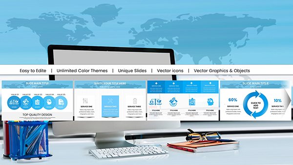
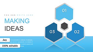
Discover how these tools simplify complex info visualization. Fully editable and ready for your brand colors, they`re the shortcut to professional-grade presentations. Dive in now and transform your next meeting.

Keynote`s native strengths shine brightest with our chart templates, which leverage its fluid transitions and vector graphics for unmatched polish. Standard charts often look flat and uninspired; ours infuse vibrancy with gradient fills, 3D effects, and interactive elements that respond to clicks.
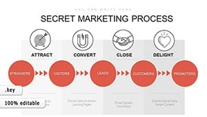
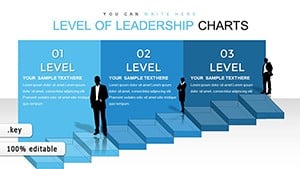
Suited for business analytics, project tracking, or academic research, these templates cater to users seeking to organize thoughts visually. A marketing lead might chart campaign ROI across quarters, revealing trends at a glance.
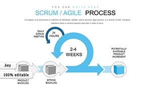
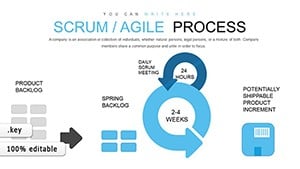
In healthcare, visualize staff rotations with Gantt-style charts; in retail, compare store performances via heat maps. These applications highlight how our templates bridge data and storytelling, making abstract metrics tangible.
Versus basic Keynote defaults, our versions include pre-styled legends and axis labels, cutting prep time by half. This efficiency lets you focus on insights rather than aesthetics.
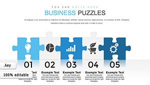
Select charts that align with your data`s story - use columns for comparisons, lines for trends. Apply consistent scaling to avoid distortion, and incorporate subtle shadows for depth without distraction.
For voiceovers, ensure high contrast for projected views. These practices elevate your delivery, ensuring every slide reinforces your key points.
These templates excel in recurring reports, like monthly KPI dashboards. Automate updates by connecting to Numbers or Excel, keeping your org`s pulse visible and actionable.
Creative twist: Overlay charts on thematic backgrounds, such as circuit patterns for tech firms, to add personality without sacrificing professionalism.
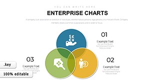
As organizations expand, our expandable chart grids accommodate more variables effortlessly. A case in point: A logistics company scaled their route efficiency visuals, optimizing deliveries and saving costs.
What sets us apart is the emphasis on interactivity - zoomable sections for detailed dives, perfect for Q&A sessions.
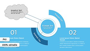
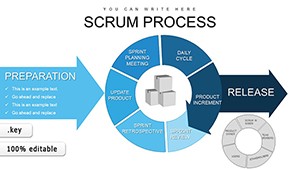
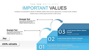
Explore combo charts merging bars and lines for multifaceted views, ideal for balanced scorecards. Integrate icons as data points for memorable infographics that stick.
Encourage experimentation: Test dark mode variants for late-night reviews. Start customizing your charts from our library today.
Copyright © 2009-2026 ImagineLayout All rights reserved.