Harness the strength of structured visuals with our oil PowerPoint diagrams, engineered for the demands of the energy landscape. Perfect for geologists, managers, and consultants, these tools distill intricate processes into digestible formats that inform and persuade.
Covering everything from fracture networks to throughput models, our diagrams leverage PowerPoint`s robust features for drag-and-drop simplicity. Replace vague sketches with polished representations that include scale bars, legend keys, and hover effects for deeper dives.
Standout benefits: Theme-consistent styling, batch editing for multiples, and export options for reports. Whether pitching expansions or auditing efficiencies, these diagrams keep your audience locked in.
Drill down deeper - peruse our oil diagrams and grab yours instantly.


Energy professionals rely on clear visuals to navigate high-stakes environments. Oil PowerPoint diagrams are indispensable for quarterly reviews, where Sankey flows depict energy losses across refining stages, spotlighting optimization opportunities. Field teams use them for site assessments, mapping terrain with overlaid infrastructure icons for rapid planning.
In investor relations, radial diagrams showcase portfolio diversification, with segments sized by reserve volumes. Educational webinars benefit from sequential builds that reveal extraction layers progressively.
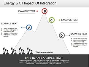
They surpass vanilla diagrams by incorporating oil-specific metrics, like API gravity scales, for instant context.
Generic diagrams falter in specificity, often requiring heavy customization that disrupts workflows. Our oil variants come pre-loaded with sector lingo - think blowout preventers and separator vessels - streamlining prep. Value adds include conditional formatting: Colors shift based on thresholds, like red for overpressure.
Embrace best practices like visual hierarchy - bold primaries, subtle secondaries - to guide eyes logically. Creatively, fuse diagrams with photos: Overlay production stats on rig images for immersive impact.
Achieve 40% quicker assemblies, per user feedback, focusing energy on analysis over aesthetics.
Highlight: Use morph transitions for evolving diagram states, like pre- to post-upgrade.
Advanced users appreciate geospatial integrations - embed GPS coordinates for accurate well placements. In compliance audits, tree diagrams branch regulatory paths, flagging non-conformities.
Outshining rivals, our designs handle dense data gracefully, with zoomable clusters preventing clutter. Case in point: A midstream company mapped logistics, cutting presentation time by half and boosting comprehension.
Prioritize legibility: Sans-serif fonts, ample whitespace. Validate with peers for clarity. Animate sparingly to underscore key transitions.
Refine your vision - choose an oil diagram and energize your next deck.
Copyright © 2009-2026 ImagineLayout All rights reserved.