Dive into the world of energy with our specialized oil Keynote diagrams, crafted to bring clarity to complex operations and strategies. Designed for petroleum engineers, executives, and analysts, these visuals turn raw data into compelling stories that drive decisions.
From upstream exploration to downstream distribution, our diagrams cover pipeline networks, reservoir models, and supply chain overviews. Forget cluttered spreadsheets - our sleek, Apple-optimized layouts use intuitive shapes and connectors for effortless editing in Keynote.
Key advantages: High-fidelity icons like rigs and refineries, responsive designs for all devices, and animation presets that simulate flows. Ideal for board meetings or field reports, they ensure your message flows as smoothly as crude.
Power up your pitch - explore oil diagrams and start customizing today.

In the volatile energy sector, precise communication can mean the difference between approval and oversight. Oil Keynote diagrams excel in operational briefings, where visualizing seismic surveys or production forecasts captivates stakeholders. For project managers, a Gantt-style diagram outlines drilling timelines with milestone icons, highlighting risks and efficiencies at a glance.
Educators in energy programs use these for lectures on extraction techniques, incorporating layered maps that reveal subsurface layers upon interaction. In sales pitches, diagrams illustrate market shares with proportional bubbles, making competitive edges pop.
Superior to basic Keynote shapes, our diagrams include pre-linked data points, updating visuals automatically as figures change - ideal for live modeling.
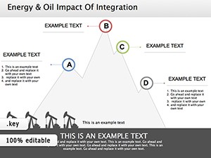
Default Keynote diagrams often feel rigid, lacking the thematic depth for niche industries. Our oil-focused set introduces authentic elements: torque wrenches, valve symbols, and gradient fills mimicking oil gradients. This authenticity builds trust, as viewers recognize familiar terminology visualized professionally.
Best practices emphasize modularity - build diagrams in sections for easy reuse across decks. For creativity, animate paths to trace oil journeys from wellhead to consumer, adding narrative flair.
Users praise the time savings: Assemble a full ops diagram in under 30 minutes versus hours from scratch.
Insight: Pair with Keynote`s magic move for seamless transitions between diagram states.
Go beyond basics with embedded calculations - diagrams that compute yields based on input variables, perfect for scenario planning. In mergers, use Venn-style overlaps to depict asset synergies.
Versus competitors, ours prioritize scalability: Vectors prevent pixelation in large formats for investor binders. Example: An offshore firm visualized rig efficiencies, securing a $10M contract through crystal-clear projections.
Layer information hierarchically: Overview first, then zooms. Ensure accessibility with descriptive labels and sufficient contrast. Test animations on external displays for smooth delivery.
Fuel your success - select an oil diagram and refine your narrative now.
Copyright © 2009-2026 ImagineLayout All rights reserved.