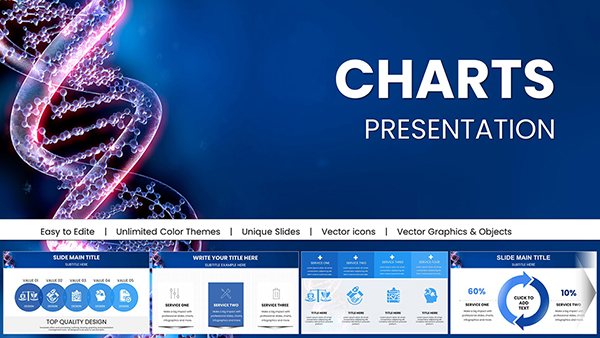
Harness the full potential of PowerPoint with our official chart templates, tailored for professionals who turn data into decisions. These slides blend functionality with flair, ideal for reports, trainings, and stakeholder updates.
Suited for analysts, trainers, and managers, they offer plug-and-play charts that integrate with Excel seamlessly, saving prep time while maximizing polish.
From bar graphs to combo visuals, each is rigged for morph transitions and smart art enhancements. Customize datasets, colors, and labels in minutes. Review the options and gear up for success.
Aim higher - choose a PowerPoint chart template and visualize victory now.


Official PowerPoint chart templates redefine slide efficiency, packing advanced features like 3D rotations and trendlines into user-friendly packages. They eclipse default charts by incorporating icon overlays and conditional formatting for nuanced storytelling.
Perfect for sales funnels or KPI dashboards, they adapt to any narrative arc.
Unlike scattered freebies, these ensure Office 365 harmony, with VBA macros for automation.
Synchronize with brand books by applying theme colors globally. Add sparklines for at-a-glance insights within tables. For accessibility, enable color-blind modes and descriptive titles.
Pro hack: Use PowerPoint`s designer tool post-edit for AI-suggested layouts.
A logistics team slashed presentation time 50% with waterfall charts dissecting cost variances. Consultants wowed clients via sunburst hierarchies unveiling org structures.
Optimize for Teams shares by flattening animations for bandwidth efficiency.
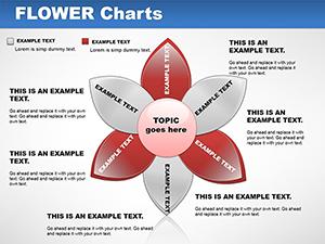
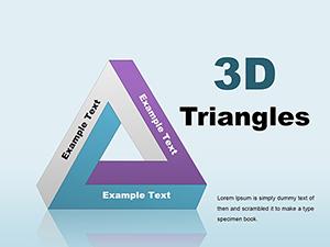
Encompassing histograms to Venn diagrams, plus animated variants for emphasis. Includes handout masters for printed backups.
Empower your slides - download today and data-drive your discourse.
Step up your PowerPoint game with these essentials. Explore the full set now.
Copyright © 2009-2026 ImagineLayout All rights reserved.