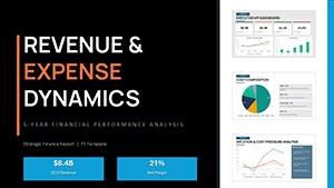
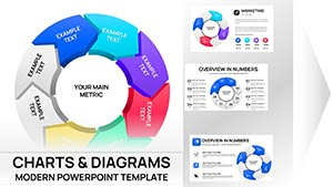
Elevate your data presentations with our curated PowerPoint chart templates, designed to make complex information accessible and engaging. From bar graphs to pie charts, these layouts help you highlight trends, comparisons, and insights without overwhelming your audience.
Targeted at analysts, executives, and educators, our templates streamline the process of creating polished slides. With pre-built structures and customizable elements, you can input your data quickly and focus on the narrative behind the numbers. Experience the power of visuals that not only inform but also persuade.
Browse this category to uncover templates that fit any dataset size or style. Built with scalability in mind, they adapt to your branding while maintaining clarity. Transform raw data into strategic assets - start exploring now and see your presentations soar.


Our PowerPoint chart templates go beyond basic Excel imports by offering thematic consistency and animation options that reveal data progressively. Standard PowerPoint charts can look dated and cluttered; ours introduce clean lines, subtle shadows, and color harmonies that align with modern design trends.
In sales environments, use stacked bar templates to showcase quarterly growth. Educators leverage line charts for trend analysis in research overviews. Marketers find scatter plots ideal for correlation studies in campaign performance.
Versus default options, these templates cut creation time in half and boost comprehension rates, as visuals process 60,000 times faster than text.
Begin with audience analysis: opt for 3D effects sparingly to avoid distortion in pie charts. Maintain a 1:3 text-to-visual ratio for balance. Animate data points to enter from left-to-right, mimicking reading flow.
A creative twist: embed interactive hyperlinks within charts, linking to detailed spreadsheets for deeper dives during Q&A. For global teams, ensure color choices are accessible, avoiding red-green contrasts.
Enhance your deck today - select a chart template and watch your data tell a story.
A tech startup utilized our combo chart template to merge sales and user growth metrics, securing investor funding with crystal-clear projections. In academia, a professor`s histogram template simplified statistical distributions, earning praise for innovative teaching.
These templates excel in hybrid formats, exporting seamlessly to PDF for handouts or video for social shares.
| Chart Type | Ideal Scenario | Key Advantage |
|---|---|---|
| Bar/Column | Categorical Data | Easy Comparisons |
| Pie/Donut | Proportions | Part-to-Whole View |
| Line/Area | Trends | Time Series Flow |
Scalable for small datasets or enterprise-level reports, each brings precision to your visuals.
Ready for standout presentations? Download now to harness data`s full potential.
Layer narratives by annotating peaks and valleys in line charts with callouts. For multivariate data, clustered columns prevent overlap. Remember, the goal is insight - let charts spark questions, not confusion.
In collaborative environments, these templates support co-editing via OneDrive, streamlining team reviews. For solo creators, version history tracks iterations effortlessly.
Ultimately, PowerPoint chart templates turn numbers into narratives that drive decisions. Embrace them to make every slide a conversation starter.
Copyright © 2009-2026 ImagineLayout All rights reserved.