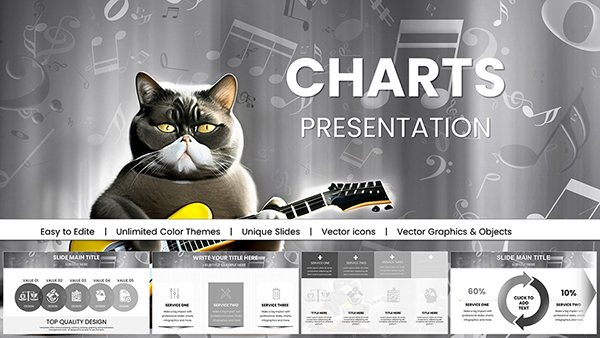
Bring your monitor technology discussions to life with our curated Keynote chart templates, crafted for Apple users who demand elegance and precision. Perfect for illustrating everything from panel types to connectivity options, these templates turn raw numbers into narratives that inform and inspire.
Targeted at designers, tech reviewers, and corporate presenters, our charts feature fluid animations and high-contrast elements that shine on Retina displays. Whether it`s a radial chart for aspect ratio breakdowns or a waterfall model for cost analyses, customization is a breeze with Keynote`s intuitive tools.
Experience the blend of Apple`s design philosophy with practical functionality. Dive into our library and select templates that align with your vision, ready to enhance your workflow from concept to delivery.


Keynote`s native strengths in smooth transitions make it ideal for tech themes, and our templates amplify this with monitor-inspired motifs like bezel borders or curve graphs echoing screen bends. They surpass basic builds by including master slides for consistent theming across decks.
For a product review, deploy our combo chart merging lines for battery life with bars for port counts, captioned with sleek sans-serif fonts for readability.
Compared to stock Keynote charts, ours add gradient fills mimicking OLED glows, elevating perceived quality.
Default charts in Keynote work for quick sketches, but lack the depth for specialized topics. Our versions incorporate build orders for phased reveals, like unveiling resolution tiers one by one, and support for hyperlinks to spec videos.
They`re formatted for 16:10 ratios, common in pro monitors, ensuring no cropping during exports. Accessibility features like alt text for charts are pre-included, aiding diverse audiences.
Feedback shows these templates boost presentation confidence by simplifying prep time.
Picture a keynote at a design summit where your area chart swells with adoption rates, syncing to music for dramatic effect. Or in a virtual pitch, treemap charts dissect budget allocations for AV setups.
A startup used our funnel chart to track lead conversion from ad views to purchases, optimizing campaigns. A school integrated pyramid charts for hierarchy in supply chain lessons on electronics.
Encourage creativity: Use polar charts for 360-degree reviews of user interfaces on curved screens.
Link chart hotspots to Magic Move transitions for fluid storytelling. For remote teams, embed polls that update live data visualizations.
In creative fields, experiment with 3D charts rotated to simulate depth perception tests.
Our Keynote charts offer modular packs - corporate clean or vibrant demo styles - for every scenario. With vector scalability, they handle ultra-high DPI without loss.
Save hours weekly; one edit propagates across slides. Pair with Keynote`s remote app for wireless control.
Elevate your tech narratives - start exploring templates immediately for standout results.
Yes, designed for Keynote 10+, with fallbacks for earlier releases.
Absolutely, access the Animate tab to tweak paths and timings.
Up to 8K, perfect for large-screen projections.
Yes, royalty-free monitor photos and icons are bundled.
Multi-user options available for enterprise needs.
Copyright © 2009-2026 ImagineLayout All rights reserved.