Transform abstract financial concepts into compelling visuals using our money PowerPoint diagrams. Tailored for professionals who need to convey revenue streams, cost analyses, and growth projections, these diagrams integrate seamlessly into your slides for maximum impact.
Financial analysts, executives, and marketers will appreciate the precision and style of these tools. With vector-based elements that scale without losing quality, you can illustrate cash flows, balance breakdowns, and investment funnels in ways that resonate with stakeholders.
Our collection emphasizes clarity over clutter, using intuitive shapes and color schemes to highlight key monetary insights. Whether preparing for board meetings or client pitches, these diagrams ensure your message lands with authority. Explore now and add a layer of professionalism to your PowerPoint decks.
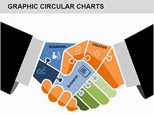
Diagrams are the backbone of effective financial storytelling, and our money-themed ones are crafted for diverse applications. In corporate settings, sales teams use funnel diagrams to depict revenue pipelines, while HR departments visualize compensation structures with hierarchical charts.
Imagine a venture capitalist presenting funding rounds: a layered pie diagram breaks down equity distribution, animated transitions reveal phased investments, and callout boxes detail ROI expectations. This approach not only informs but persuades, turning data into decisions.
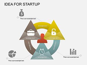
Educators leverage these diagrams in workshops to teach economic principles, such as supply-demand curves adapted for market money flows. Creatives in advertising might repurpose cycle diagrams to outline campaign ROI timelines.
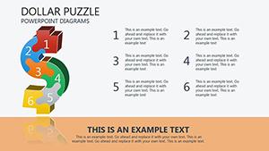
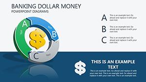
Built-in PowerPoint diagrams often feel rigid and uninspired, lacking the thematic depth for finance-specific narratives. Our versions incorporate money motifs - like coin stacks for accumulation or arrow flows for transactions - while supporting advanced animations that reveal data progressively.
They outperform defaults by offering editable connectors that auto-adjust with data changes and layered groupings for complex hierarchies, saving time on revisions and enhancing visual consistency across slides.
The true value lies in their adaptability: swap icons for global currencies, tweak gradients for brand alignment, or embed live data links for real-time updates. Best practices include limiting colors to three for focus, using consistent line weights for professionalism, and testing animations on various devices.
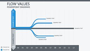
For innovative twists, a nonprofit could use a waterfall diagram to track donation impacts, cascading from inflows to program outcomes. Or, a retailer analyzing seasonal sales with a Gantt-style money timeline, plotting promotions against revenue spikes.
Eager to visualize your financial story? Select from our diagrams and integrate them into your next presentation today.
All diagrams are native PowerPoint files (.pptx), fully editable without additional software.
Yes, each includes preset animations; customize paths and timings via PowerPoint`s animation pane.
Designed for scalability, they handle extensive data through grouped elements and expandable sections.
As vector graphics, they scale infinitely - hold Shift while dragging corners to maintain proportions.
Compatible with PowerPoint 2016 and later; some advanced features require 2019+.
Copyright © 2009-2026 ImagineLayout All rights reserved.