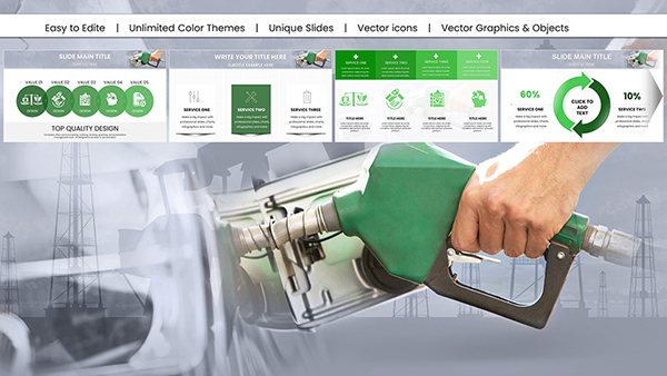
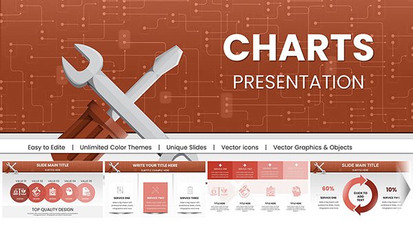
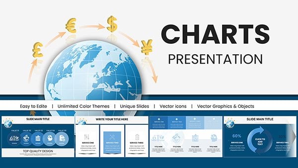
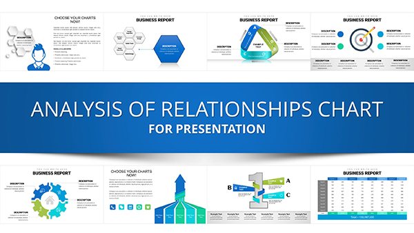
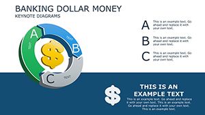
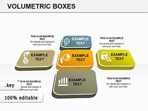
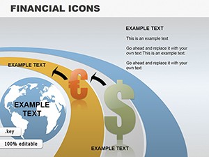
Make your financial data speak volumes through our money Keynote charts, engineered to turn spreadsheets into stunning visuals. Perfect for dissecting budgets, monitoring investments, or forecasting earnings, these charts harness Keynote`s rendering power for flawless displays.
Aimed at data-savvy users like analysts and managers, they feature responsive designs that adapt to themes and resolutions. With built-in legends and tooltips, interpreting monetary fluctuations becomes intuitive, engaging audiences without overwhelming them.
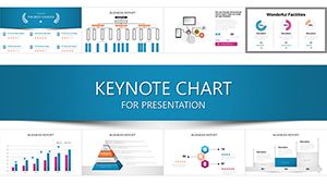
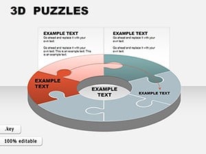
From bar graphs tracking quarterly profits to line charts mapping market volatility, our selection covers essential formats. Embrace the elegance of Apple presentations and let your charts convey confidence. Start browsing to find the perfect fit for your next fiscal review.


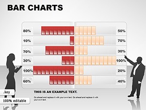
Charts are indispensable for financial communication, and ours cater to real-world needs. Auditors employ stacked bars to layer expense categories, revealing hidden inefficiencies at a glance.
Envision a marketing director analyzing ad spend ROI: a combo chart merges bars for costs with lines for returns, animated to build quarter-by-quarter, fostering strategic discussions.
Strategists use scatter plots to correlate economic indicators with company performance, while trainers simulate budget scenarios with adjustable axis charts.
Keynote`s default charts are functional but bland for finance, missing thematic icons like upward arrows for gains. Our pre-styled versions include currency axes, percentage labels, and trend lines, plus export-ready transparency for overlays.
They reduce setup by 60%, with drag-to-recolor and data-import wizards streamlining updates.
Strengths shine in interactivity - hover effects reveal exact figures, and master chart styles ensure deck uniformity. Advice: choose chart types matching data dimensionality (e.g., 2D for comparisons), declutter with white space, and align with brand hues for cohesion.
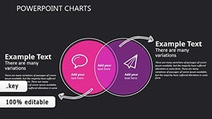
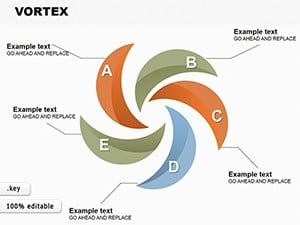
Innovatively, a fundraiser charts donation trends with heat maps, warming to peak giving seasons, or a consultant visualizes merger synergies via Venn overlaps scaled to savings.
Ready for chart-topping presentations? Grab a money chart template and chart your success.
Paste from Excel or Numbers directly; Keynote auto-maps columns to series.
Yes, subtle builds like sequential bar growth enhance reveal without distraction.
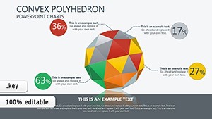
Optional 3D effects available, but 2D recommended for data accuracy.
Fully adaptable - auto-invert colors for Keynote`s dark interface.
Vector-based for infinite scalability and 4K export clarity.
Copyright © 2009-2026 ImagineLayout All rights reserved.