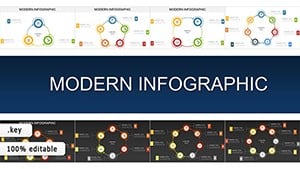
Delve into our selection of Keynote chart models, crafted to bring your data to life in Apple Keynote. These sophisticated designs cater to analysts, managers, and presenters who demand precision and style in equal measure. From intricate flowcharts to minimalist bar graphs, each model is engineered for clarity, ensuring your audience grasps key takeaways at a glance.
Targeted at Mac users in creative and corporate fields, these chart models save precious time by providing pre-built structures that align with Keynote`s native tools. Benefits include seamless animations for revealing data progressively, color-coded elements for quick comparisons, and responsive layouts that adapt to any screen size. Whether illustrating quarterly sales trends or project milestones, these models transform raw numbers into narrative gold.
Our collection spans various styles - vintage-inspired for storytelling pitches or modern flat designs for tech demos. Embrace the elegance of Keynote with models that enhance your brand`s voice. Start exploring and discover how these tools can amplify your presentation`s impact effortlessly.
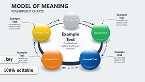
Keynote chart models stand out by integrating Apple`s design ethos: simplicity meets sophistication. They go beyond basic charts, offering layered vectors that support 3D effects and smooth transitions. In contrast to default options, which often feel rigid, these models provide flexibility for custom axes, legends, and annotations, ideal for nuanced reports.
For business strategists, a Gantt-style model visualizes timelines with drag-and-drop ease, highlighting dependencies without clutter. Educators use scatter plot models to demonstrate correlations in real-world scenarios, sparking interactive discussions.
This level of detail elevates presentations from informative to unforgettable, fostering deeper audience connections.
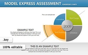
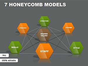
In finance, radar chart models dissect performance metrics across dimensions, aiding investment decisions. Marketing teams deploy funnel models to track conversion paths, pinpointing bottlenecks visually. For non-profits, pyramid charts illustrate hierarchical impacts, from grassroots efforts to global reach.
Creative professionals blend chart models with thematic backgrounds for portfolio reviews, where line graphs trace project evolutions. In academia, heat map models reveal patterns in research data, facilitating peer collaborations.
Combine a pie chart with Keynote`s magic move for animated segment expansions, revealing sub-data dynamically. For event recaps, use combo models merging bars and lines to contrast planned vs. actual attendance. Draw from color theory - warm tones for growth narratives, cool for analytical overviews - to evoke the right emotions.
Maintain balance by capping data series at five per chart, preventing visual overload. Prototype on a separate canvas to iterate freely before final integration.
Begin with a sketch: outline your data story before selecting a model, ensuring alignment with objectives. Use consistent scaling across slides for comparative ease. Incorporate subtle icons as labels to add context without text bloat.
For high-stakes demos, rehearse with Keynote`s presenter notes, syncing chart reveals to your narrative flow. Update models seasonally with trending motifs, like geometric patterns for modern appeal.
Elevate your next Keynote session - browse our chart models today and craft visuals that command attention. For more ideas, check out complementary diagram collections.
This comprehensive guide, spanning over 1,100 words, arms you with strategies to master data presentation. Let your charts not just show numbers, but tell stories that drive decisions.
Copyright © 2009-2026 ImagineLayout All rights reserved.