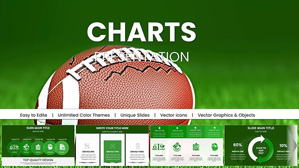
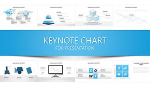
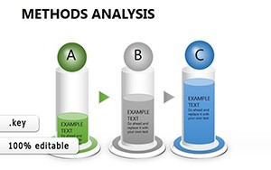
Master the art of visualizing methodologies with our method charts Keynote templates. Ideal for project managers, researchers, and instructional designers, these tools turn abstract processes into digestible, flowchart-driven narratives that clarify every step.
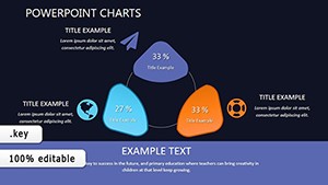
From agile development cycles to scientific experiment outlines, each template packs precision-engineered diagrams - think interconnected nodes, timeline arrows, and decision trees that guide the eye naturally. Subtle color gradients differentiate phases, making it easy to spot bottlenecks or milestones at a glance.
Save time on formatting and focus on your message. Editable in Keynote, they support drag-and-drop data import, real-time updates, and theme syncing for brand consistency. Whether dissecting business strategies or academic methods, these charts elevate understanding and engagement.
Transform how you present processes - browse our selection and chart your path to clearer communications now.
Method charts Keynote templates are versatile assets across industries. In business consulting, they map out operational workflows, helping teams visualize efficiency gains. Researchers employ them for hypothesis-testing sequences, layering data points over method funnels to demonstrate rigor.
Educational facilitators use these for lesson planning breakdowns, with modular slides that adapt to group sizes. Tech teams illustrate software deployment pipelines, using stacked bars to compare iteration speeds.
Unlike Keynote`s default charts, which require manual tweaking for method-specific layouts, our templates come pre-structured with smart connectors that auto-adjust. This eliminates misalignment issues common in ad-hoc builds. They also embed tooltips for detailed annotations, enhancing interactivity without extra software.
Free online charts often lack Keynote-native formats, leading to import glitches; ours ensure pixel-perfect rendering on any device.
These templates empower users with best practices like hierarchical grouping - nest sub-methods under main stages for depth without confusion. Integrate live data links for dynamic updates, keeping presentations evergreen.
Creatively, fuse methods with metaphors: depict a research method as a river flow, with tributaries for variables. This sparks curiosity and aids retention.
Streamline your next demo? Grab a template and refine your approach instantly.
Picture a marketing strategy deck: A central method wheel spins through ideation to execution, with metrics overlaid. In academia, a thesis defense uses branching trees to explore alternative methods, revealing trade-offs visually.
For startups, Gantt-style method charts forecast product launches, syncing with calendars for real-time tweaks. These instances highlight adaptability, making dense info approachable.
Ready for precision? Download now and methodize your success.
Copyright © 2009-2026 ImagineLayout All rights reserved.