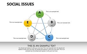
Transform your medical presentations with our specialized PowerPoint diagram templates. Tailored for healthcare educators, researchers, and clinicians, these templates feature precise illustrations of anatomical structures, flowcharts for treatment protocols, and infographics for epidemiological data, ensuring clarity and engagement.
Ideal for grand rounds, patient education sessions, or academic lectures, our diagrams use color-coded schemes inspired by medical standards - like reds for arterial paths and blues for venous systems - to enhance comprehension. Editable elements allow seamless integration of your data, from pie charts on disease prevalence to timelines of surgical procedures.
Boost audience retention with visuals that stand out from plain text slides. Our collection supports high-resolution exports, maintaining quality for projections or handouts. Dive into our library and elevate your next medical discourse.

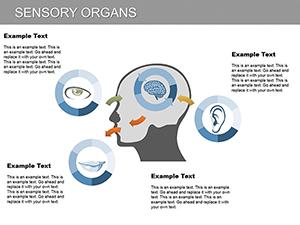
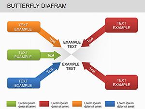
Diagrams are the backbone of effective medical communication, turning abstract concepts into tangible insights. Our medical PowerPoint diagram templates excel here, offering pre-built structures that save hours of design time. Unlike default PowerPoint shapes, which often look rudimentary, ours incorporate realistic textures and annotations, such as labeled cross-sections of organs or branching decision trees for diagnostics.
This depth aids in scenarios like explaining immunotherapy pathways to oncology teams, where a single well-crafted diagram can clarify mechanisms better than paragraphs of notes.
Best practices: Limit to 3-5 elements per slide to avoid overload, and use consistent iconography for brand familiarity. Animate transitions sparingly to focus on content reveal.
Leverage SmartArt enhancements in our templates for dynamic resizing without distortion. Add hyperlinks to diagrams linking to reference studies, enriching interactivity. For accessibility, include alt text for all visuals, ensuring screen reader compatibility in diverse audiences.
Compared to stock medical clipart, our diagrams are vector-based, scaling infinitely for large venue prints or digital shares.
A neurology resident adapted our brain mapping template for a TEDx talk, incorporating fMRI scan overlays that captivated viewers and sparked collaborations. In another case, a public health nurse used epidemic curve diagrams to advocate for vaccination drives, resulting in community-wide uptake.
These stories underscore how targeted visuals drive action in healthcare narratives.
Pair diagrams with storytelling arcs: Start with overviews, drill into details, and end with implications. This structure keeps sessions under 45 minutes while maximizing retention. Export options include animated GIFs for social media teasers, extending reach beyond live events.
Are these templates compatible with older PowerPoint versions?Yes, designed for PowerPoint 2016 and later, with backward-compatible files available upon request.
Can I incorporate 3D elements into the diagrams?Absolutely, templates include placeholders for 3D models via add-ins like Morph transition.
How do I source accurate medical data for diagrams?Integrate APIs from sources like WHO datasets; our templates have formula-linked charts for auto-updates.
Is there support for non-English medical terminology?Templates feature bilingual layers, easily toggled for international conferences.
What about color-blind friendly options?All schemes pass WCAG tests, with desaturated alternatives included.
Can diagrams be used in printed materials?High-res exports ensure crisp prints up to poster size.
Empower your presentations with precision diagrams. Download now and visualize success!
Copyright © 2009-2026 ImagineLayout All rights reserved.